Role
I helped Wpay in making their complex payments ecosystem feel simple; bringing clarity, structure, and visual breathing room through UX, digital art direction, and illustration
The project
Wpay is a retail payments platform, designed for retailers and backed by Australia's largest supermarket retailer: the Woolworths Group.
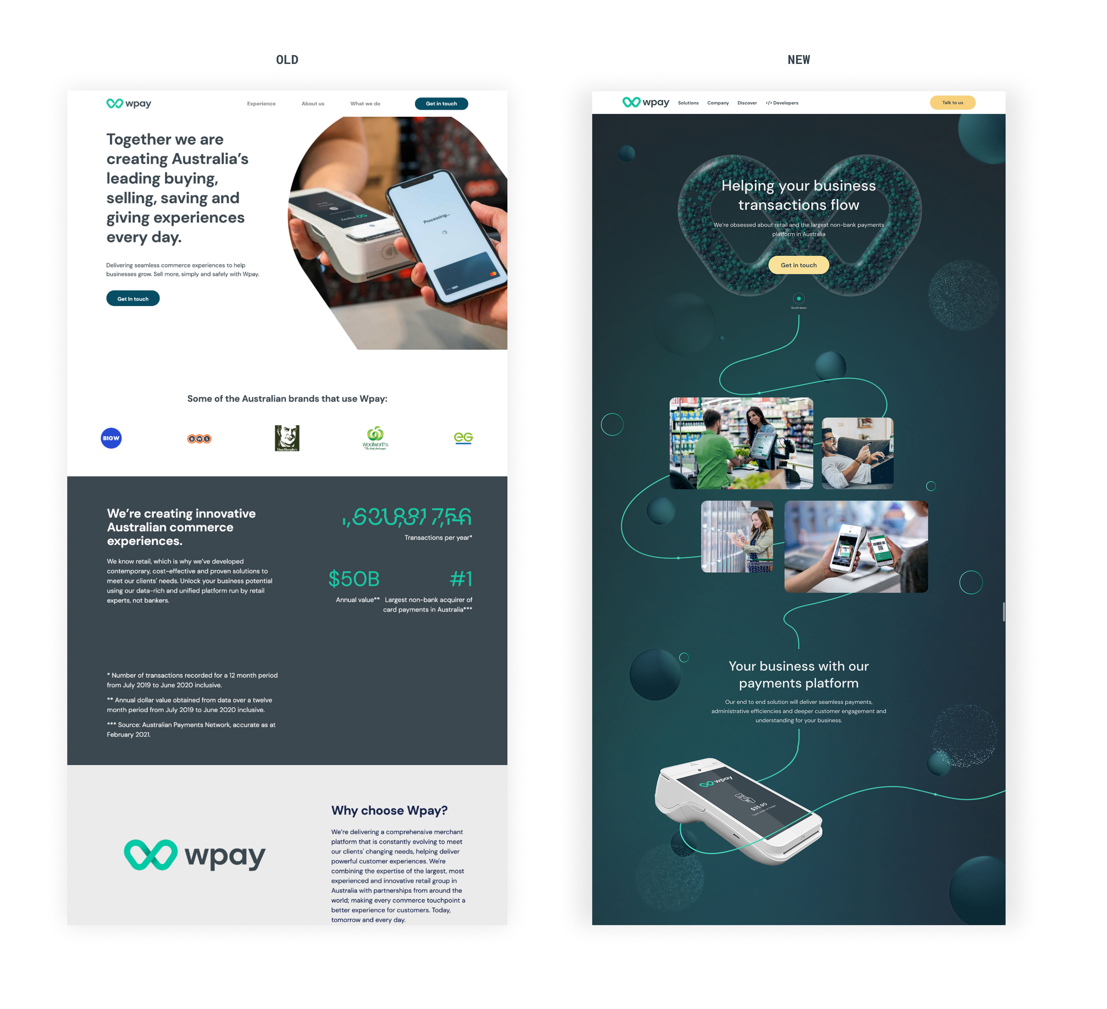
They process over a billion transactions a year, powering everything from checkouts to terminals to dashboards. But their design language was inconsistent, their existing website felt limited and dated
They process over a billion transactions a year, powering everything from checkouts to terminals to dashboards. But their design language was inconsistent, their existing website felt limited and dated
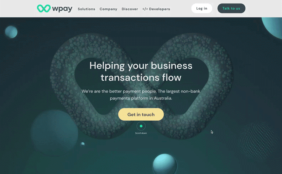
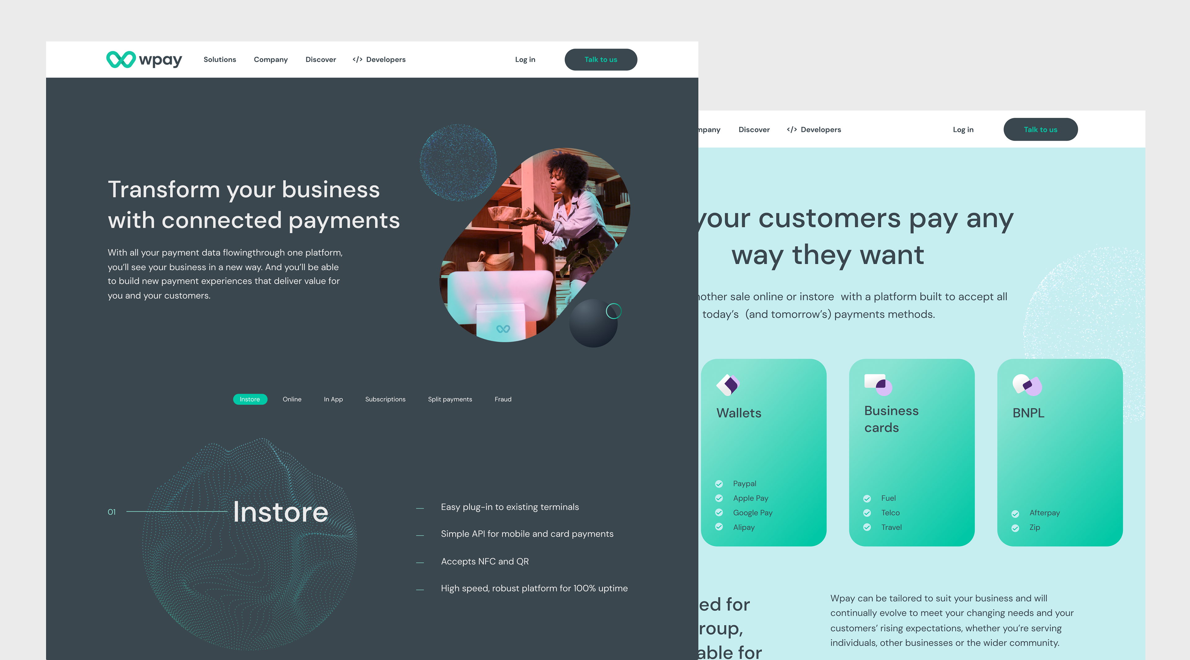
Designed for Flow
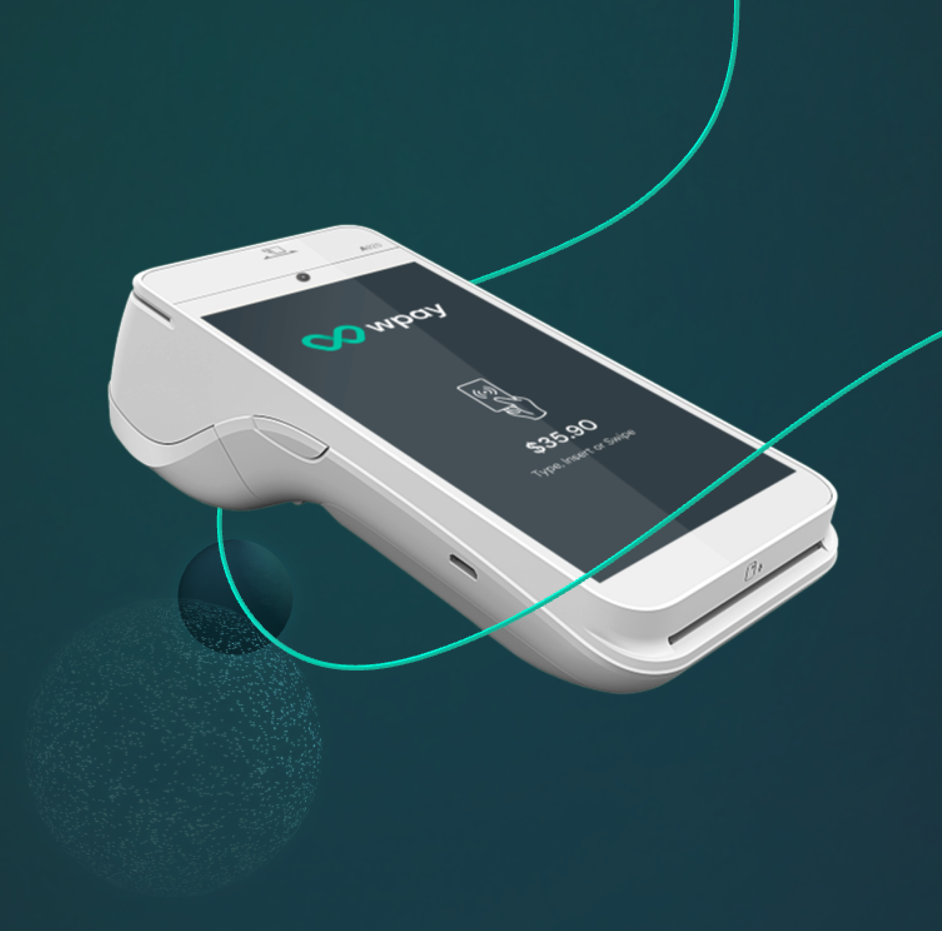
I set out to create a website that felt fluid, modern, and unmistakably Wpay; something that broke from the static, transactional look of typical payment brands. Inspired by the idea of "flow" and seamless experiences, the design leans on 3D elements and parallax animation to bring movement and clarity to complex offerings.
The goal was to inform through storytelling (60% entertainment, 40% information) crafting a site that feels more like a living product than a static brochure.
The goal was to inform through storytelling (60% entertainment, 40% information) crafting a site that feels more like a living product than a static brochure.
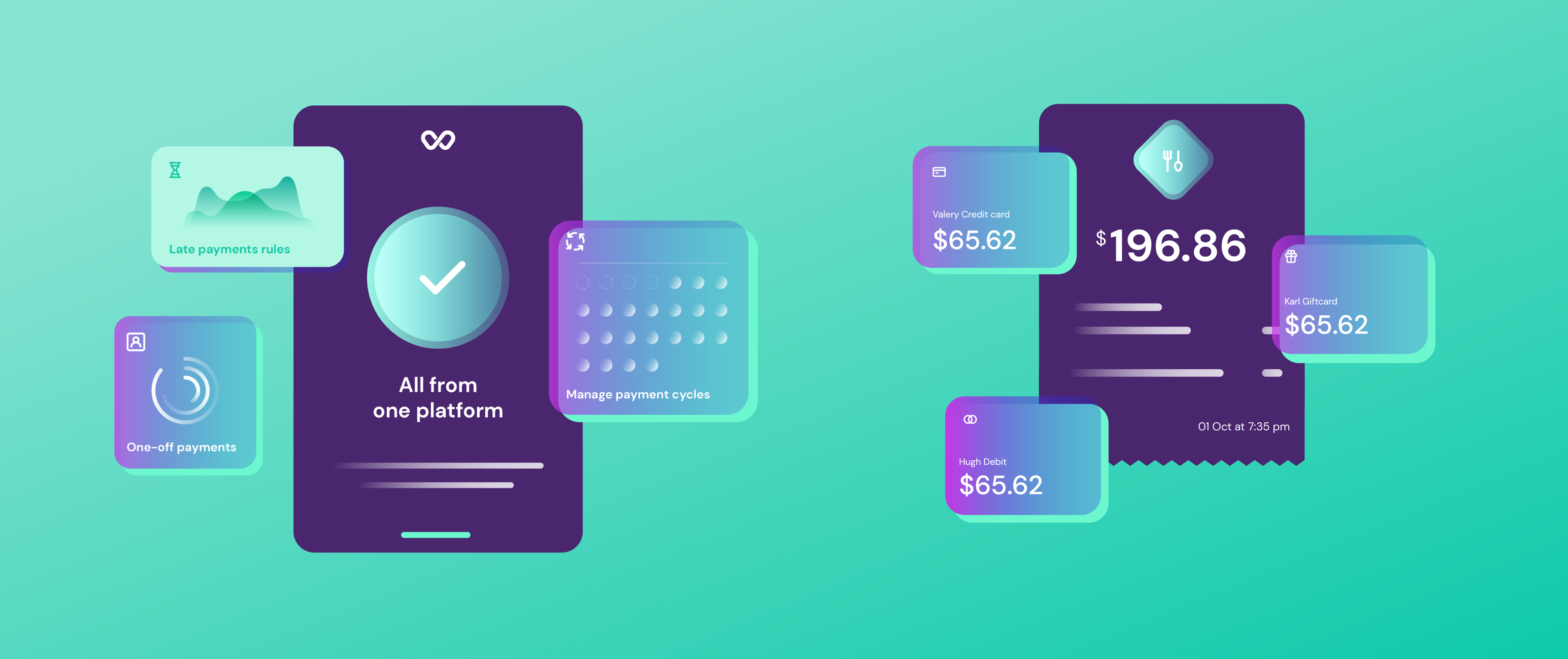
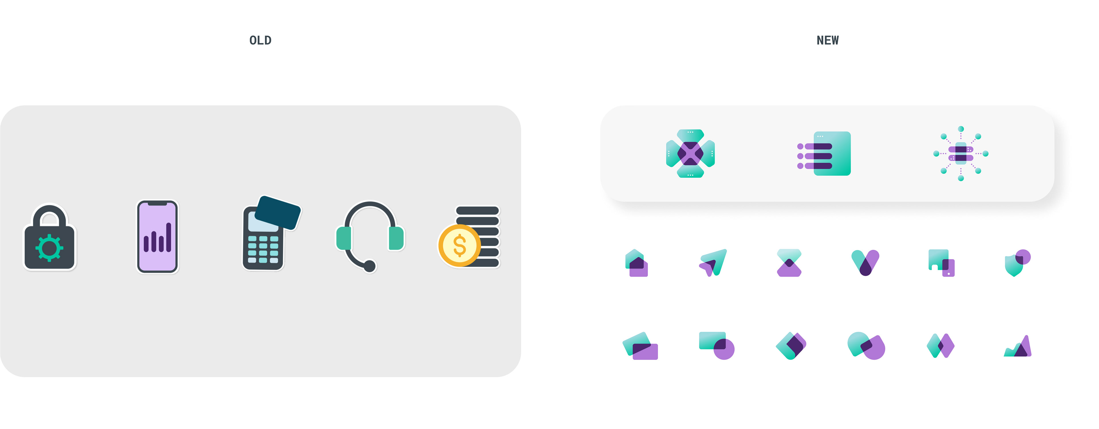
Built the Foundations
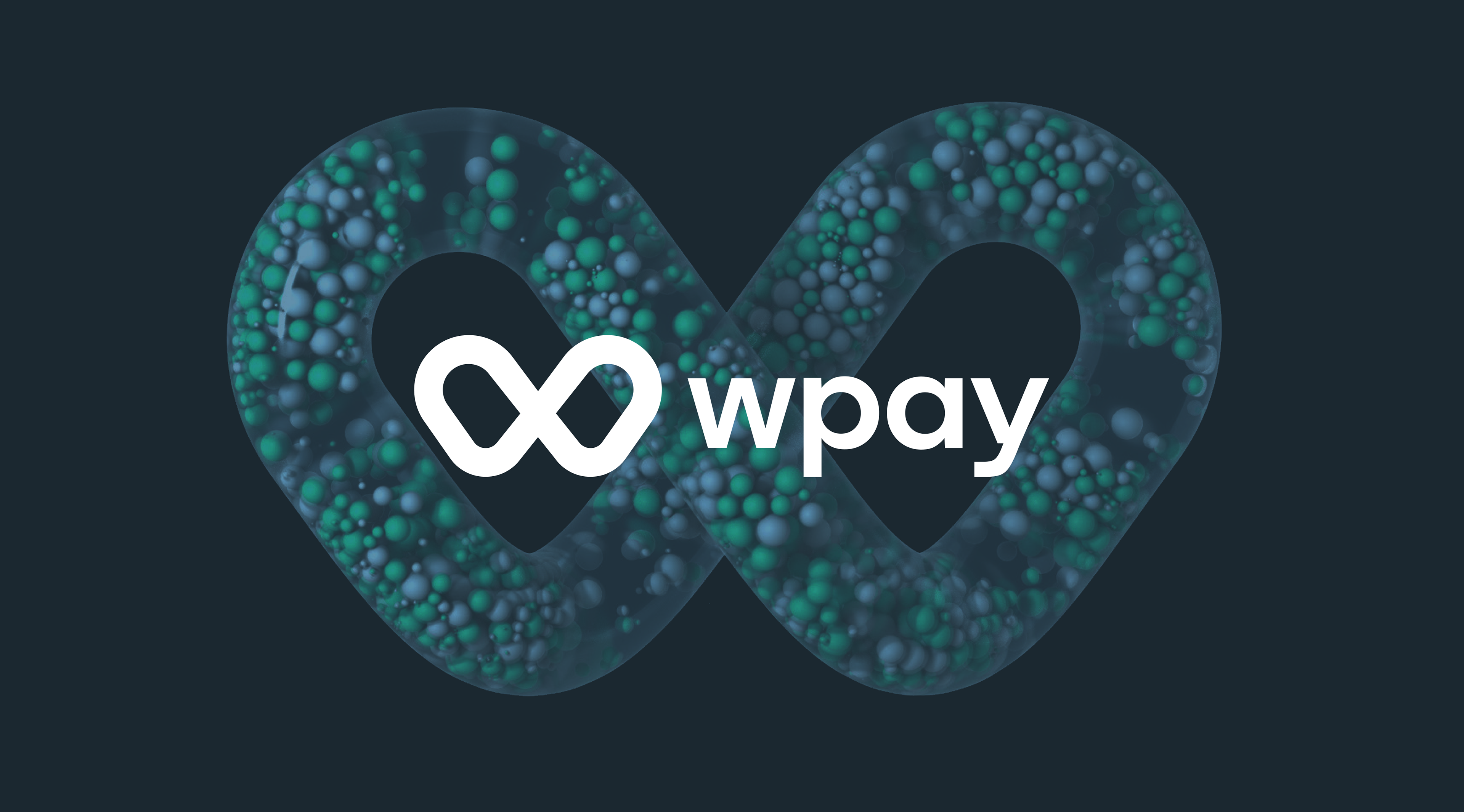
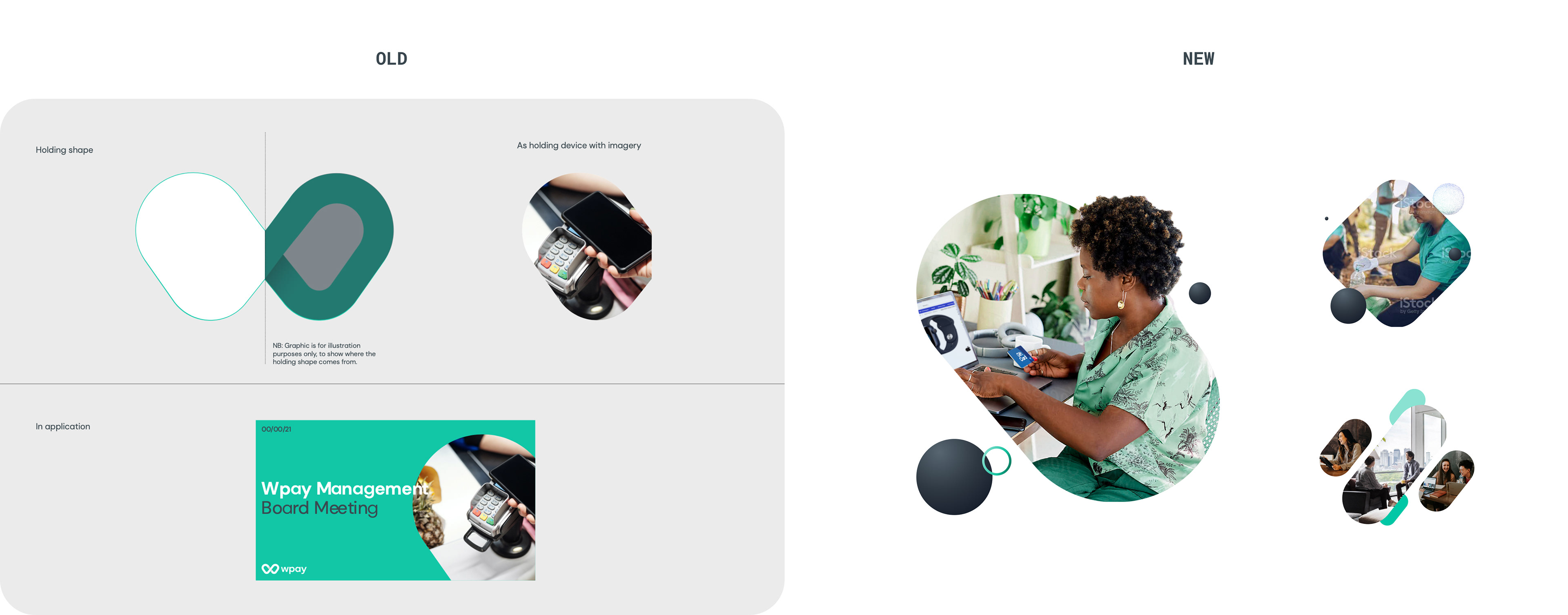
The old Wpay visual identity wasn't positioning the brand as innovative and future-focused.
They needed a modern, flexible design system that could power everything.


Why It Mattered
Wpay is reshaping how Woolworths approaches payments, and the design needed to clearly support that evolution. It was about giving the brand the confidence and space it deserved. The work helped shift Wpay from a behind-the-scenes function to a visible, strategic part of the business with a clearer story and a stronger presence.