Role
I led design, art direction, and Squarespace implementation, giving C&C a brand and site as bold and sharp as the talent they cast.
The project
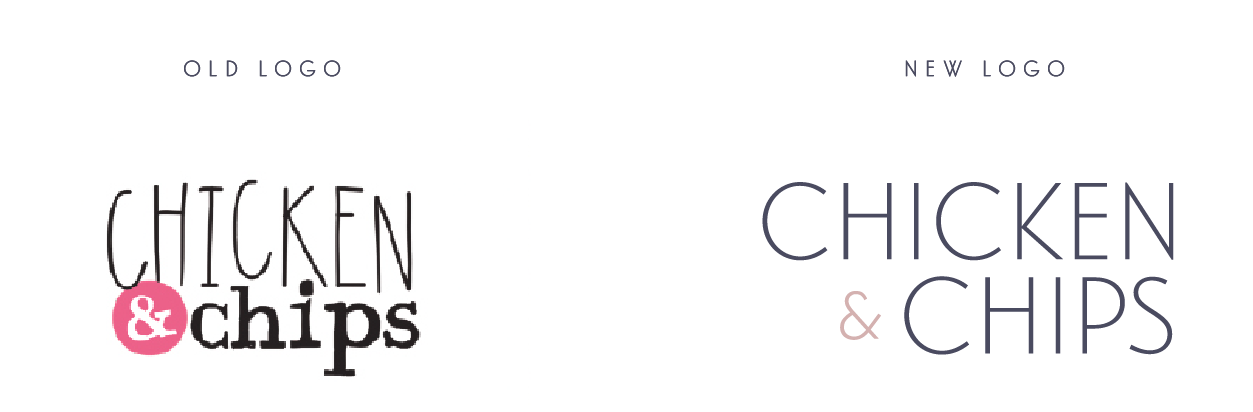
When a casting agency like Chicken & Chips starts making waves, it needs a brand that matches the buzz. Their old logo and website? Outdated, clunky, and a little too DIY.
With a fresh move to an art deco-inspired office and a growing reputation in the industry, they came to us for a full glow-up: something sleek, stylish, and easy to manage.
Brief: Keep it on Squarespace. Make it timeless.
With a fresh move to an art deco-inspired office and a growing reputation in the industry, they came to us for a full glow-up: something sleek, stylish, and easy to manage.
Brief: Keep it on Squarespace. Make it timeless.
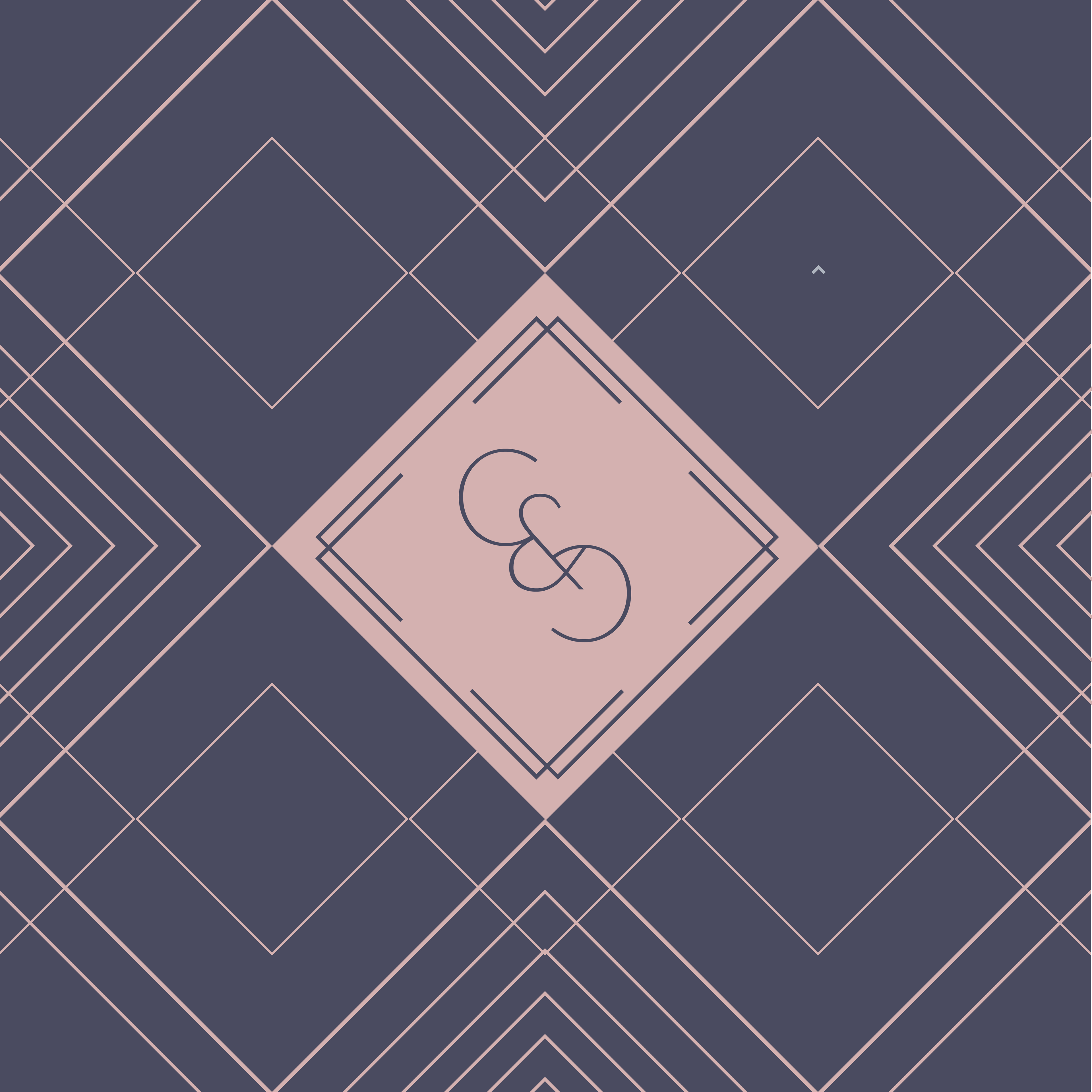
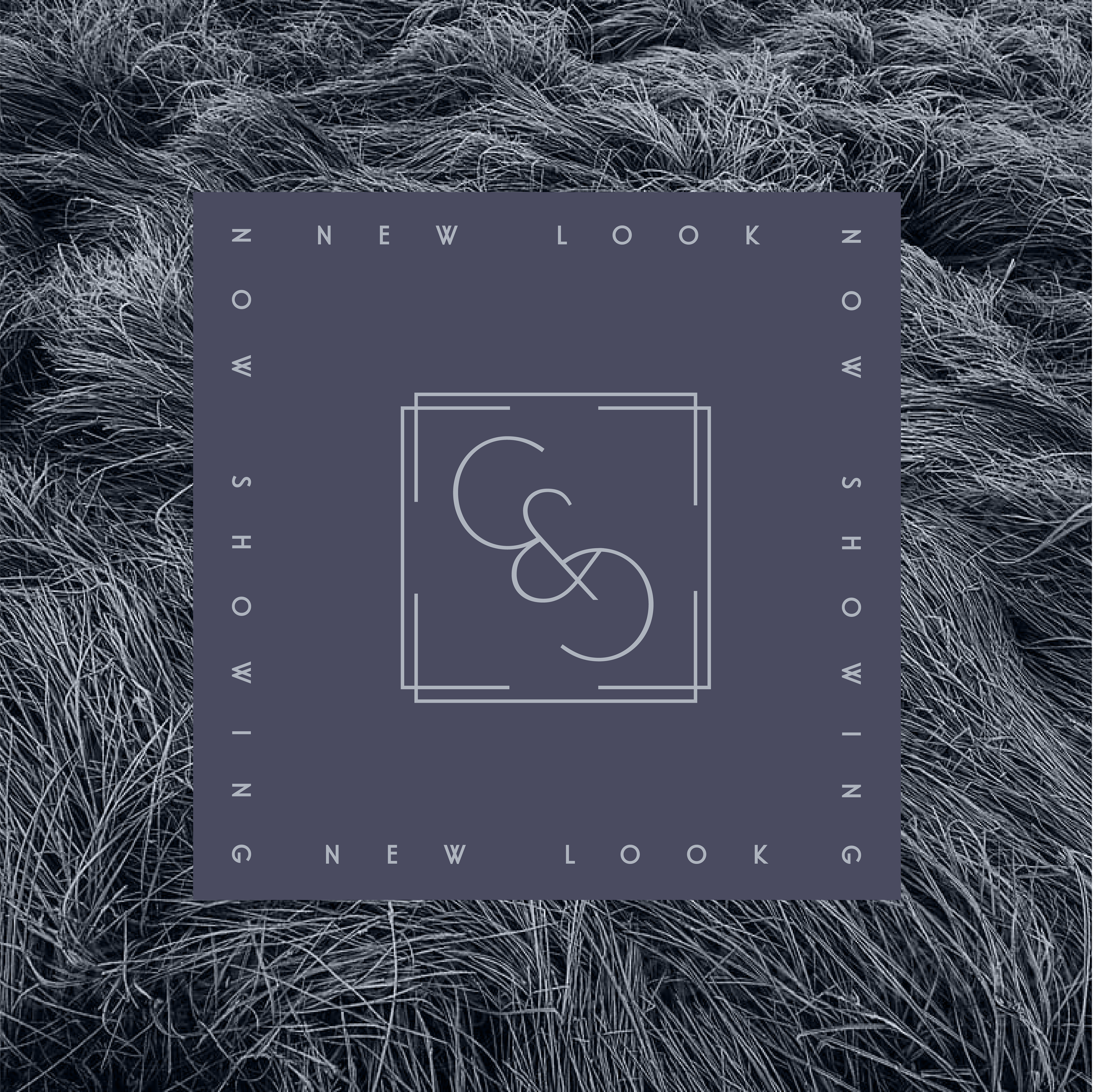
Brand with Vintage Soul & Modern Swagger
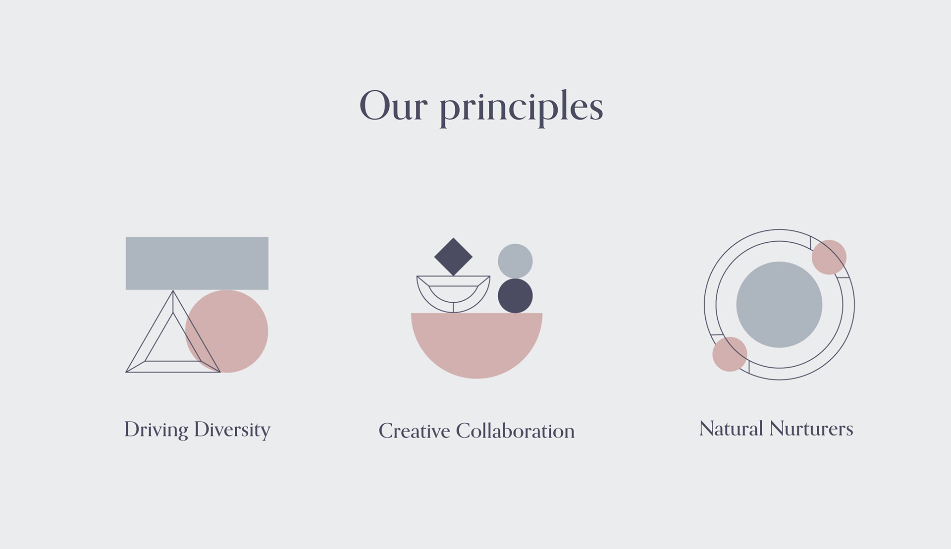
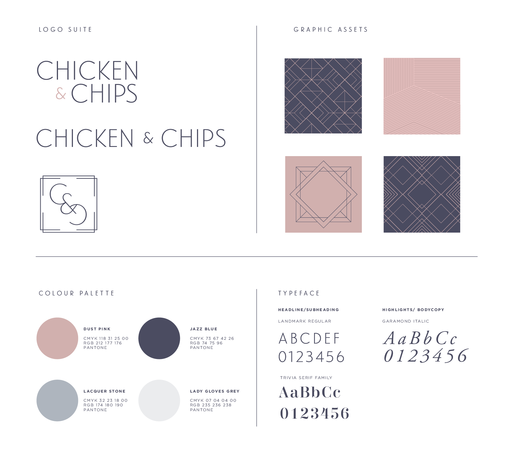
Art deco was our north star: elegant geometry, subtle curves, and timeless charm.
We said goodbye to the playful old wordmark and created a more versatile identity, built to scale.
We said goodbye to the playful old wordmark and created a more versatile identity, built to scale.
• A refined logo suite, including a classic monogram
• Graphic devices inspired by deco patterns and framing
• Supporting elements that added polish without losing personality
• Everything was designed to feel premium - but still totally C&C.
• Graphic devices inspired by deco patterns and framing
• Supporting elements that added polish without losing personality
• Everything was designed to feel premium - but still totally C&C.
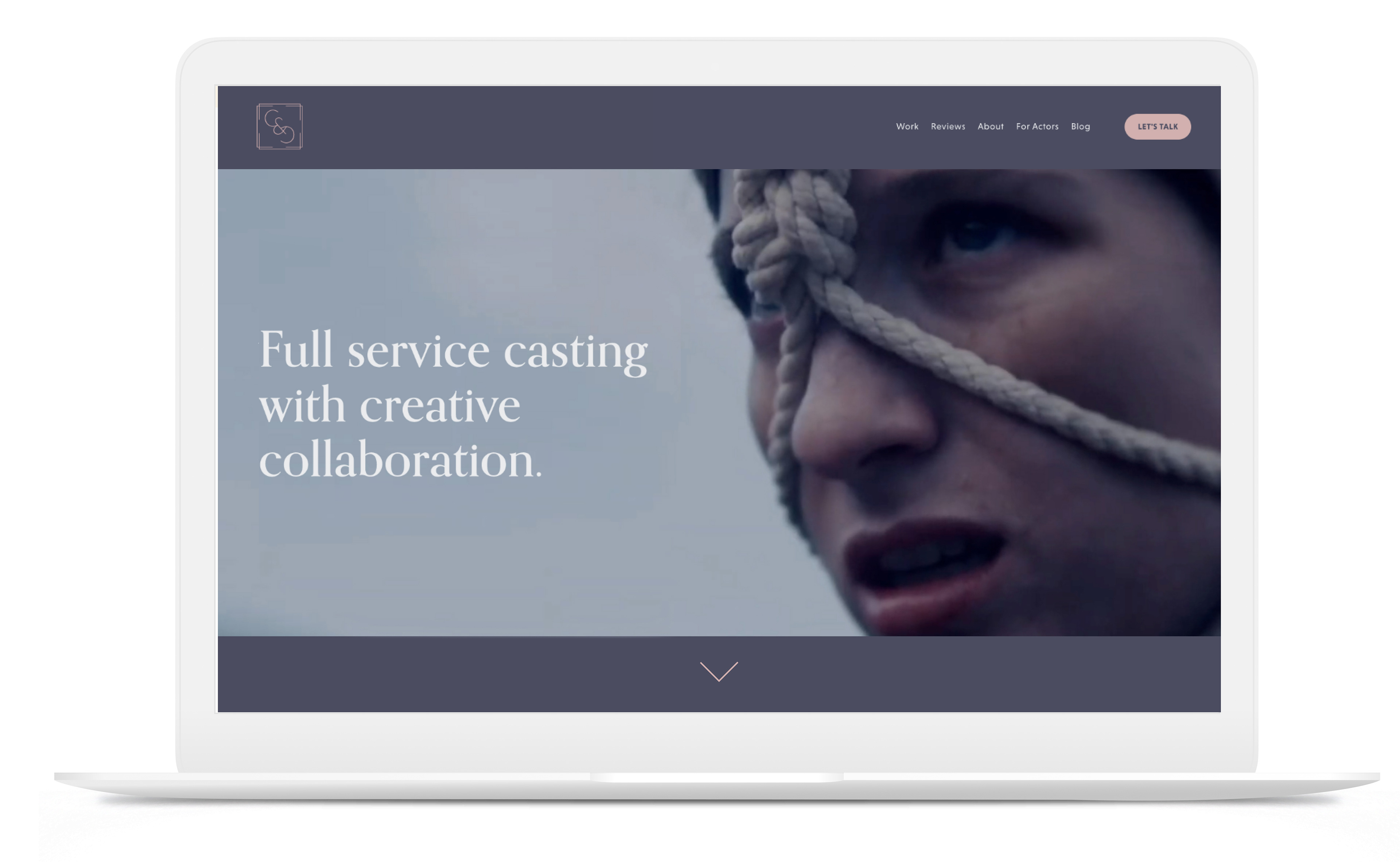
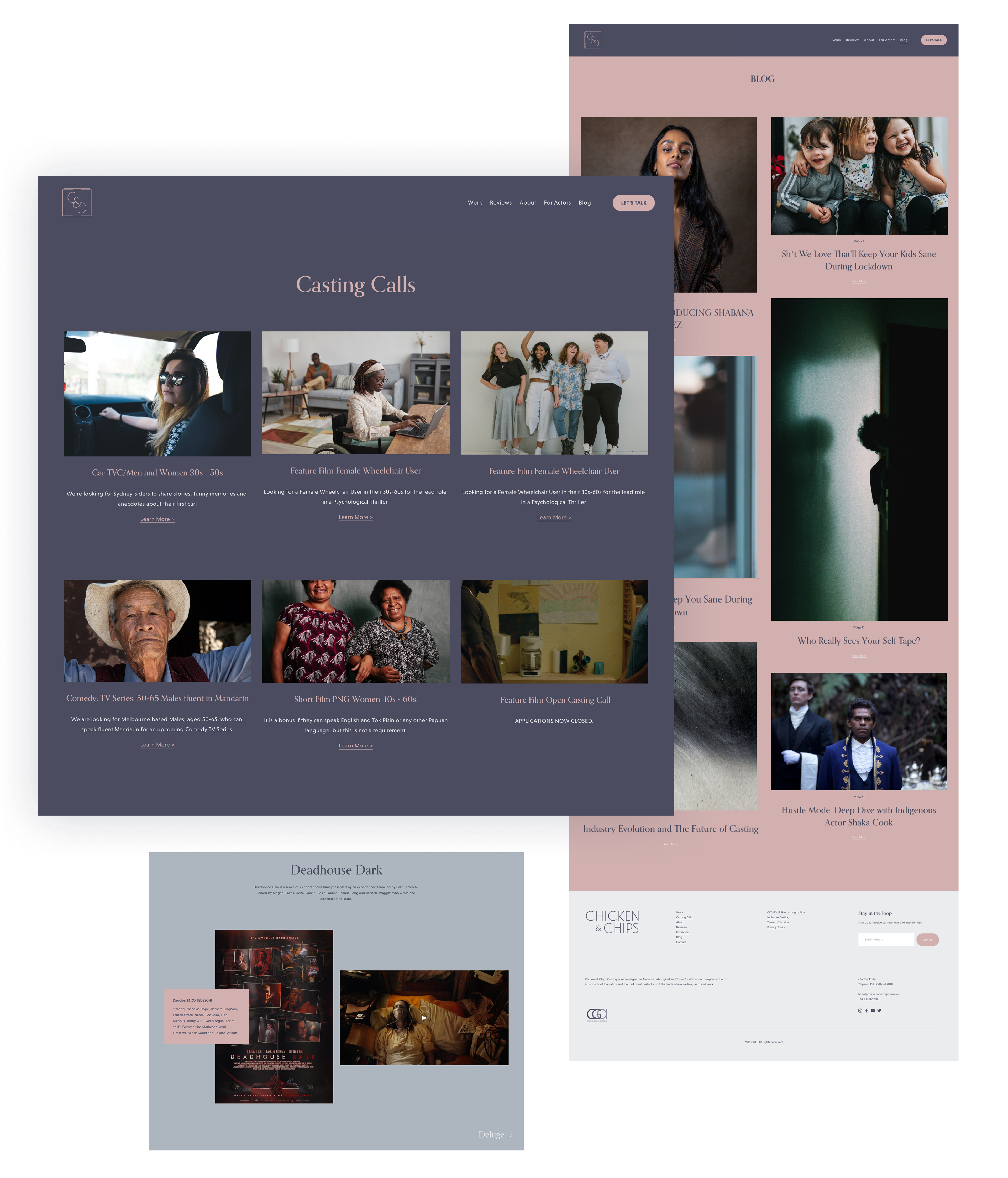
A whole new website
As part of the brand refresh, I completed a full re-design of C&C’s website using Squarespace as this was the client specific request.
The problem:
The old website lacked any type of UX. There was no homepage, users were taken directly to the about page which was jarring. In addition to that, there were no CTA buttons anywhere on the website leaving the user without a direct goal and on a final note there were almost next to zero images but it was all lengthy copy.
Key upgrades:
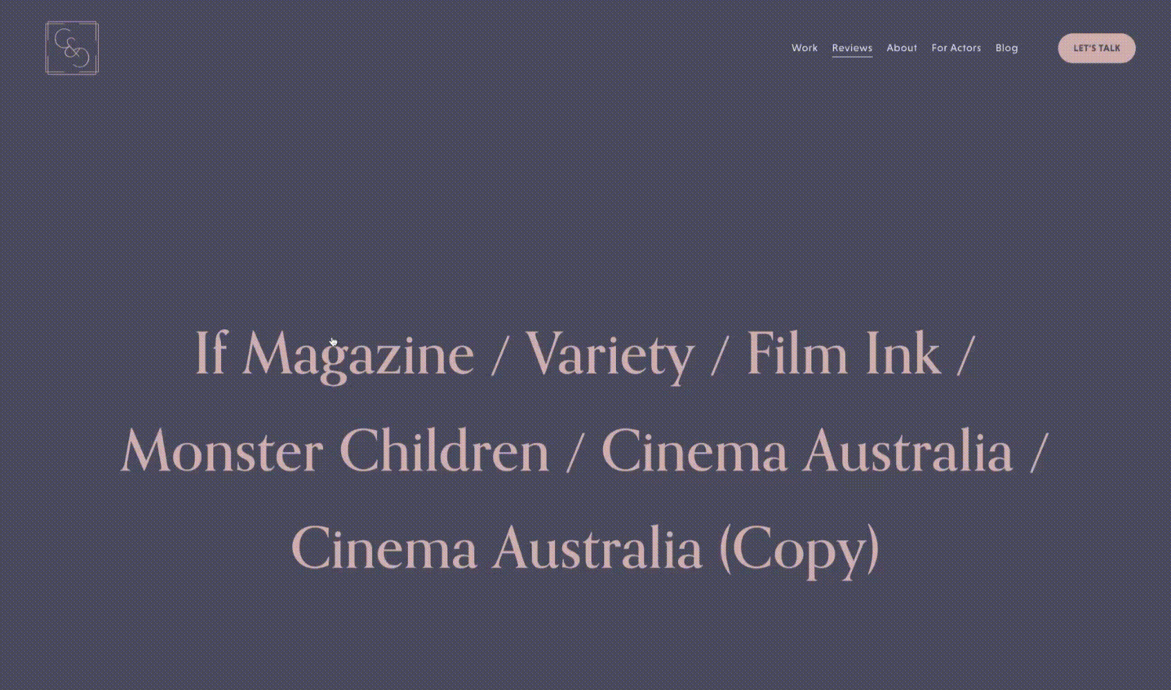
Clear site map and IA to guide users naturally
Strong homepage with entry points to talent, services, and contact
CTA buttons throughout to give users next steps
Photo-led layouts that show (not just tell) what C&C does best
The problem:
The old website lacked any type of UX. There was no homepage, users were taken directly to the about page which was jarring. In addition to that, there were no CTA buttons anywhere on the website leaving the user without a direct goal and on a final note there were almost next to zero images but it was all lengthy copy.
Key upgrades:
Clear site map and IA to guide users naturally
Strong homepage with entry points to talent, services, and contact
CTA buttons throughout to give users next steps
Photo-led layouts that show (not just tell) what C&C does best
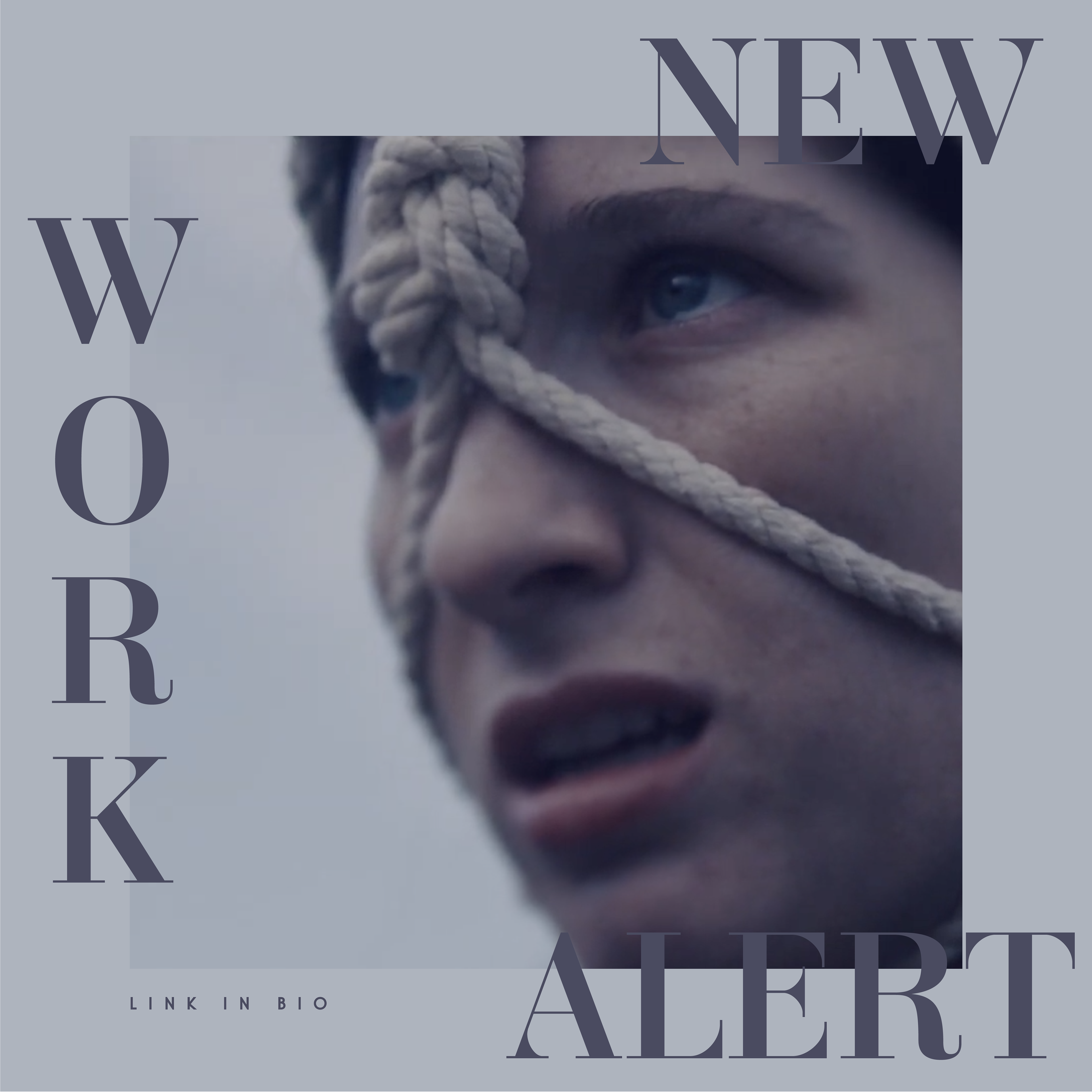
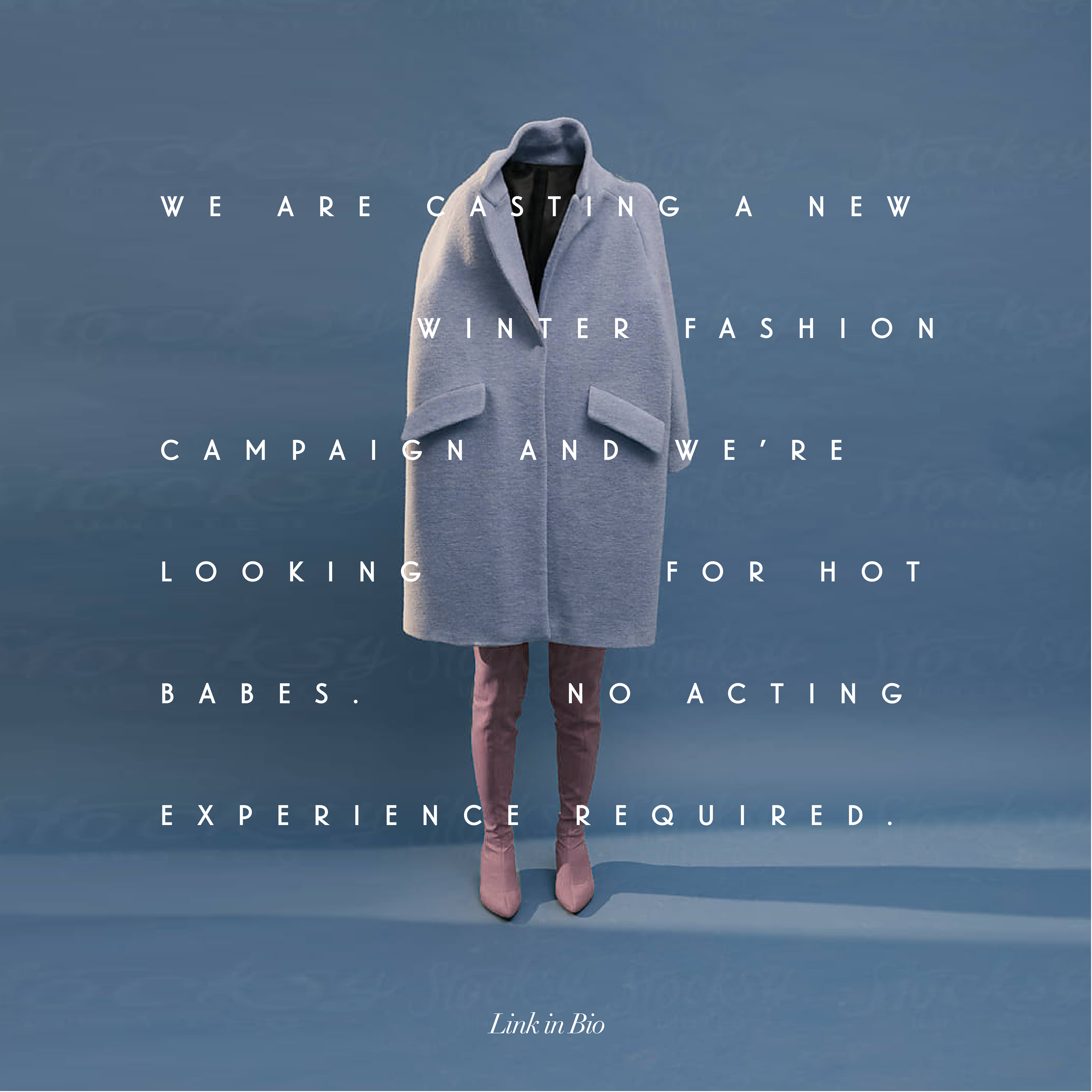
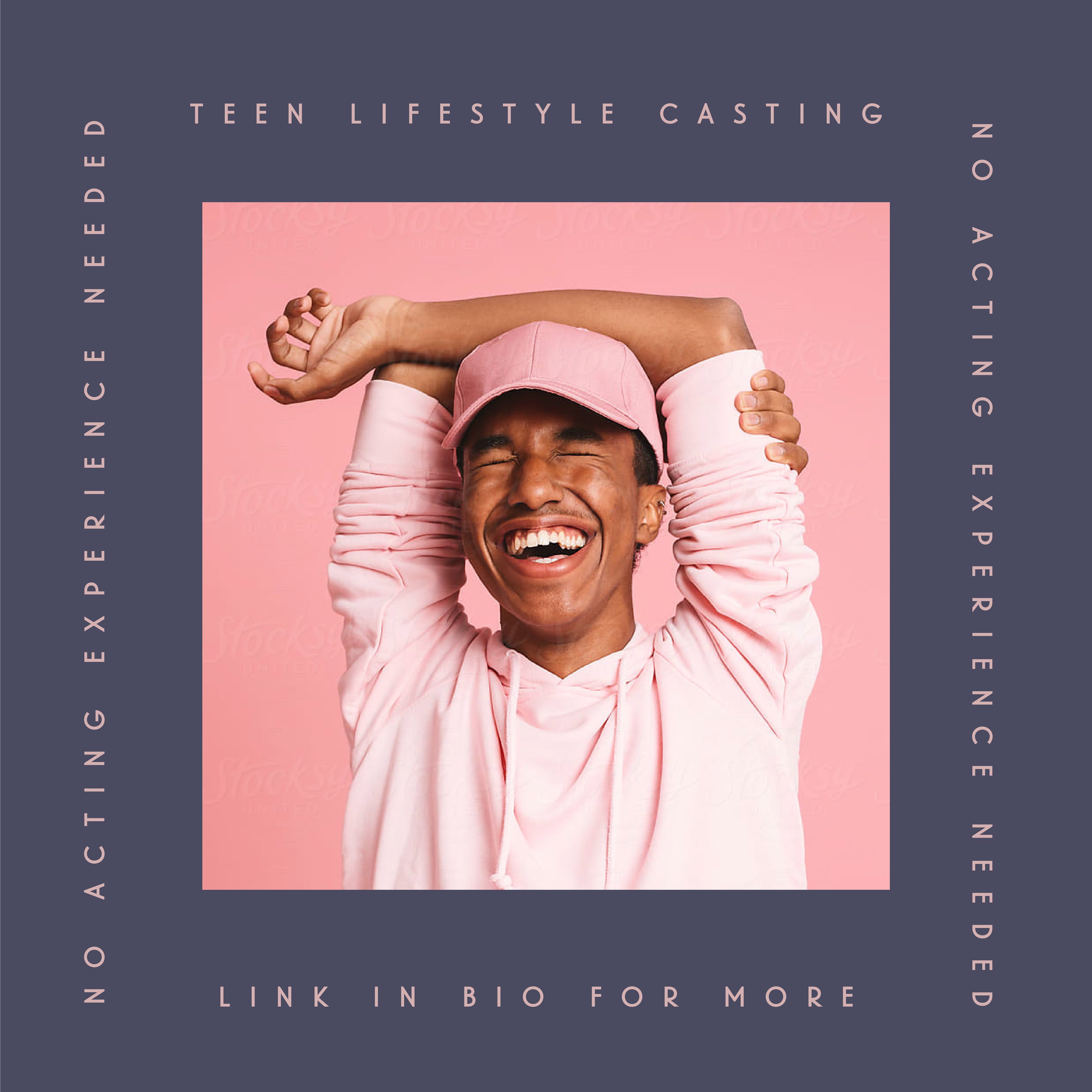
Social presence
Before, their social brand felt disconnected from their site and identity.
So we extended the new visual language into their Instagram and online assets, creating a bold, cohesive presence.
So we extended the new visual language into their Instagram and online assets, creating a bold, cohesive presence.


Why it mattered
C&C was already doing amazing work, they just needed a brand and digital home to match.
This project was about taking their credibility and leveling it up with design clarity, visual consistency, and a whole lot of style. It was fun, fast-paced, and all about delivering something the client could actually own and run with.
This project was about taking their credibility and leveling it up with design clarity, visual consistency, and a whole lot of style. It was fun, fast-paced, and all about delivering something the client could actually own and run with.