Role
I owned the project end-to-end: strategy, art direction, branding, website redesign, and a full refresh of marketing assets. I was hands-on in the work, but also responsible for aligning stakeholders and presenting direction to the founder and leadership team.
The project
Talon.One is B2B SaaS platform for promotions, loyalty, and gamification.
In simple terms, it helps brands create moments that actually feel personal: a small thank-you after a repeat purchase, a tailored offer when someone’s been away for a while, or a reward that feels like it was made just for them.
In simple terms, it helps brands create moments that actually feel personal: a small thank-you after a repeat purchase, a tailored offer when someone’s been away for a while, or a reward that feels like it was made just for them.
A long overdue transformation
In 2024, we kicked off a long-needed but incredibly exciting initiative: refreshing the entire Talon.One brand.
Talon.One launched in 2015 as a pioneer in automated promotions. The product, service, and revenue leadership were unquestionable. But by 2024, the brand and website didn’t reflect any of that. The overall story felt flat in a market that was becoming more crowded by the day. We needed a true shift. We needed emotion, personality, and an ownable identity.
The work before the work of brand refresh
Despite the company’s strong market position, the brand simply didn’t show it. Our goal was to move away from feature-first messaging and toward something that made people feel something.
Through customer and competitor research, along with internal workshops, we uncovered a powerful blend of three brand archetypes: the Hero (confident and inspiring), the Explorer (curious and versatile), and the Creator (innovative and expressive)
Explorations
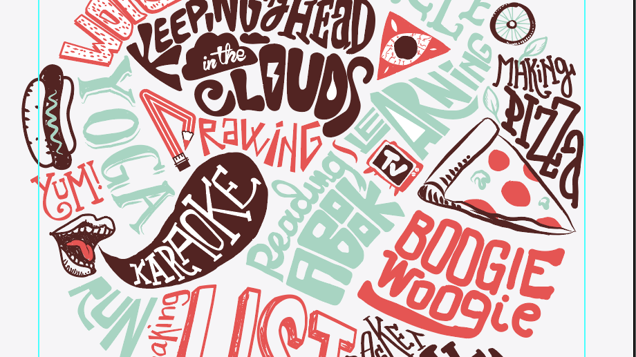
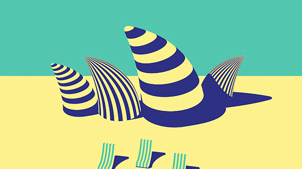
With the research in place, we dove into visual exploration. We experimented with color, type, layout, patterns, UI, and illustration, translating each archetype into its own visual language. This phase was all about testing.
Bringing the brand to life
After pitching the three archetypes to the founders, we landed on a hybrid direction: one that combined the Hero’s confidence, the Explorer’s curiosity, and the Creator’s innovation.
From there, we shaped a clear, strategic brand positioning that encapsulated it all:
Make every interaction count.
From there, we shaped a clear, strategic brand positioning that encapsulated it all:
Make every interaction count.
The shape of data
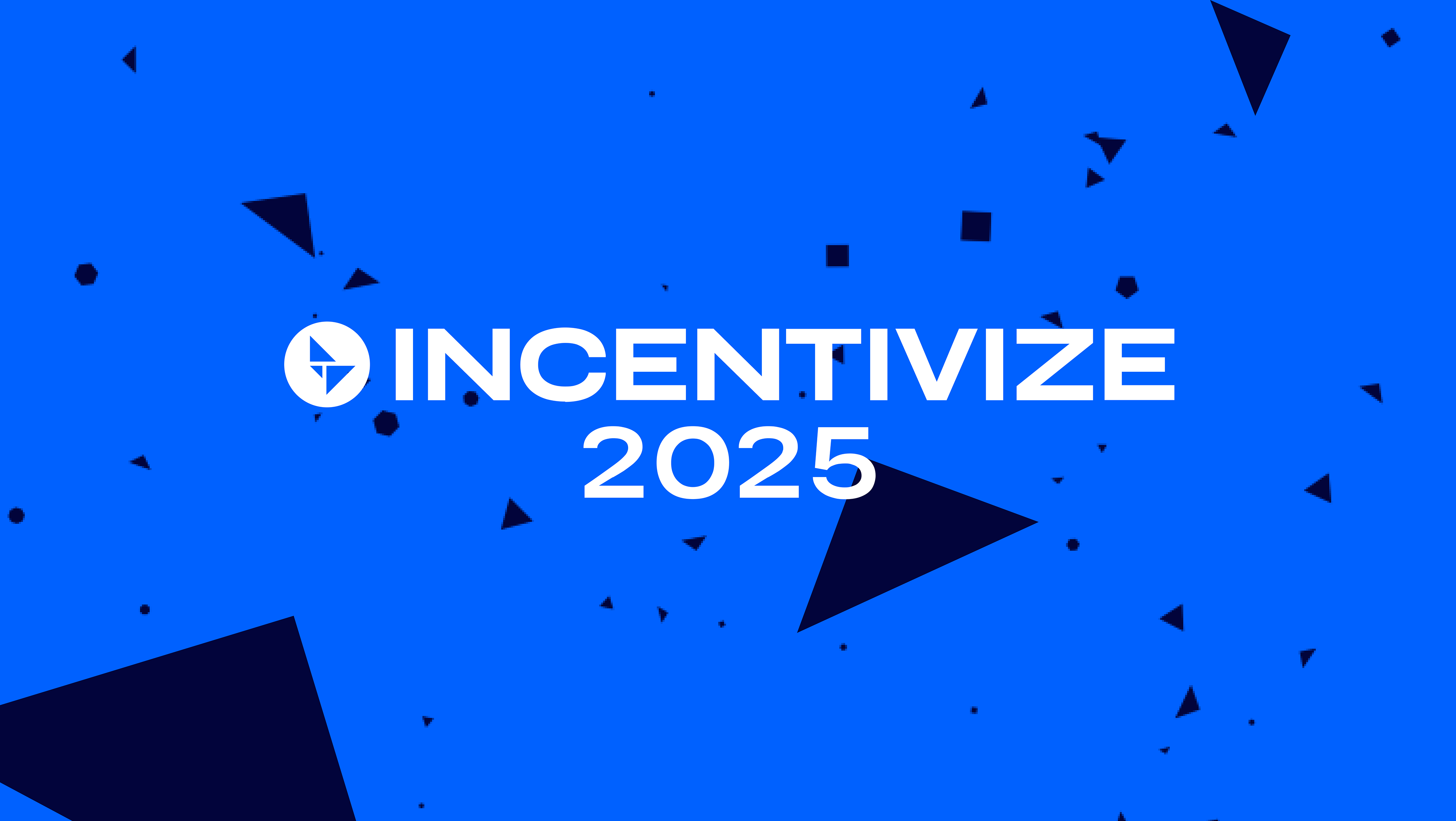
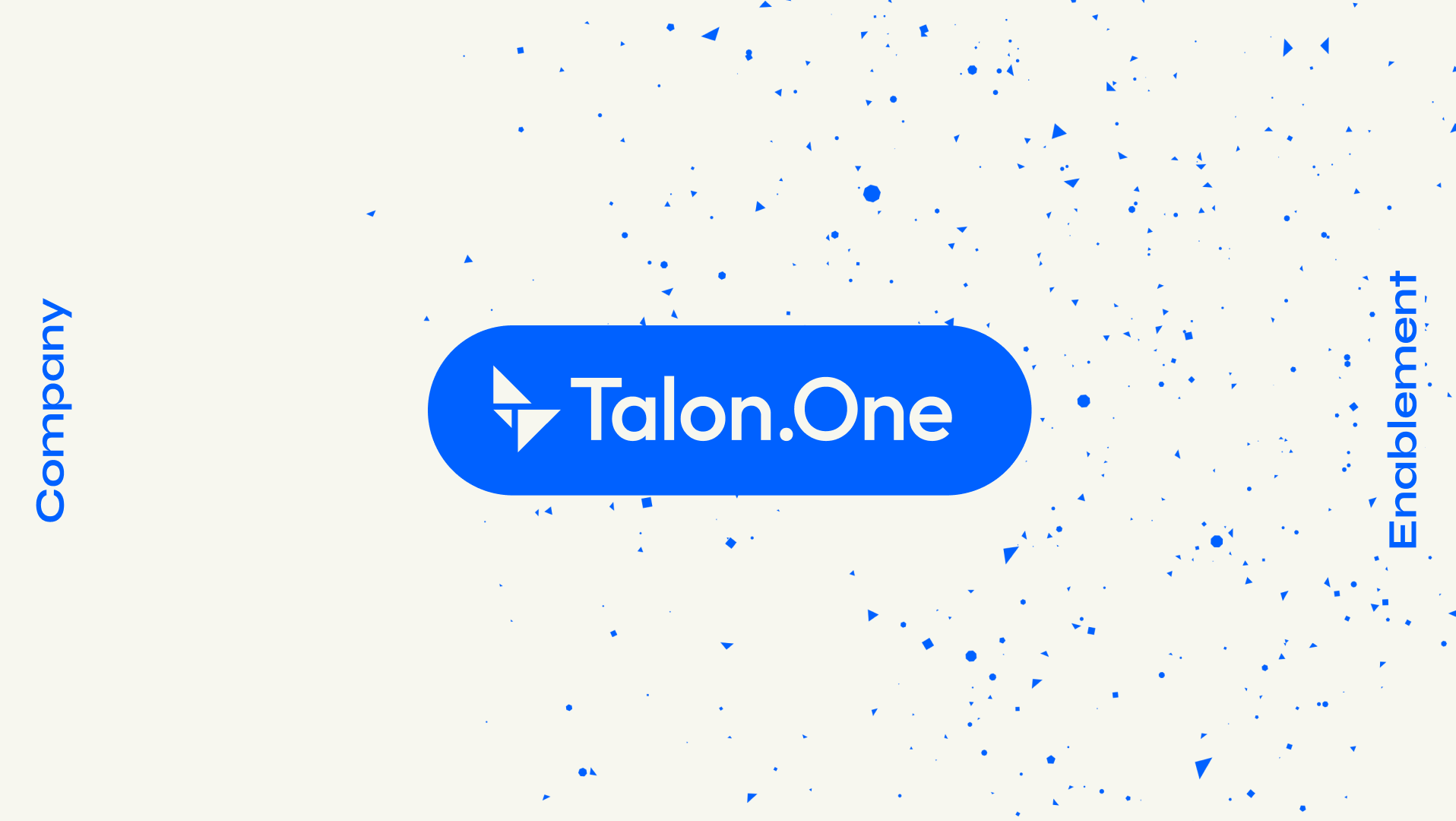
To bring our new positioning Make every interaction count to life, we built a flexible, layered identity system rooted in what Talon.One does best: making sense of massive amounts of data in real time. We started with floating particles representing scattered customer data. As Talon.One processes and interprets them, these particles gather and form something meaningful: a customer profile.
Inspired by the Talon.One logo (three triangles, nine points), we created dynamic geometric shapes that evolve with every new insight.
The Result
The new brand came to life across every touchpoint: marketing materials, sales decks, product UI, event booths, motion, and more. From confident typography to the evolving particle system, every touchpoint reinforced what Talon.One truly does: transform data into meaningful moments.
Why It Mattered
This strategic brand refresh wasn’t just aesthetic. IIt gave the company a sharper, more compelling story: one that helped secure $135M in funding and opened doors to major enterprise conversations.
Most importantly, the brand finally matched the product and the ambition behind it.
Most importantly, the brand finally matched the product and the ambition behind it.
