Role
From digital to physical, I led UX/UI design and art direction to breathe new life into their identity across website, signage, tone of voice, comms, and more.
The project
This one hit different.
Aged care is complex and often emotional. Families feel overwhelmed, residents feel unsure, and brands? Well, most just blend into a beige sea of sameness.
Huon Regional Care had the heart (deeply personal, community-focused care in Southern Tasmania) but their brand didn’t reflect it.
The brief? Keep the logo. Rethink everything else.
The Goal
Stand out in a category that rarely tries to.
We needed to show aged care as a positive step forward, not just a last resort. That meant:
• A calming yet modern visual language
• Content that felt human, not clinical
• A user experience that supported clarity and confidence
We needed to show aged care as a positive step forward, not just a last resort. That meant:
• A calming yet modern visual language
• Content that felt human, not clinical
• A user experience that supported clarity and confidence
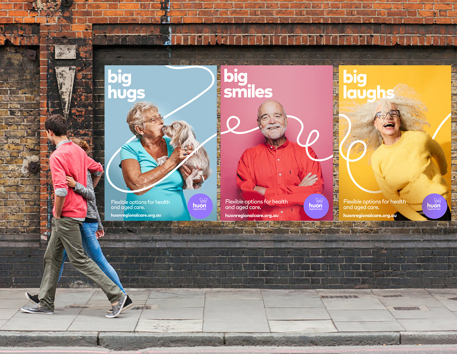
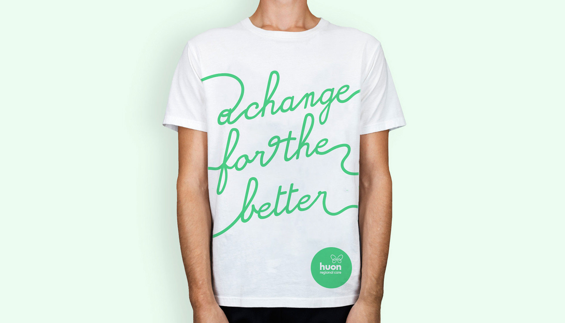
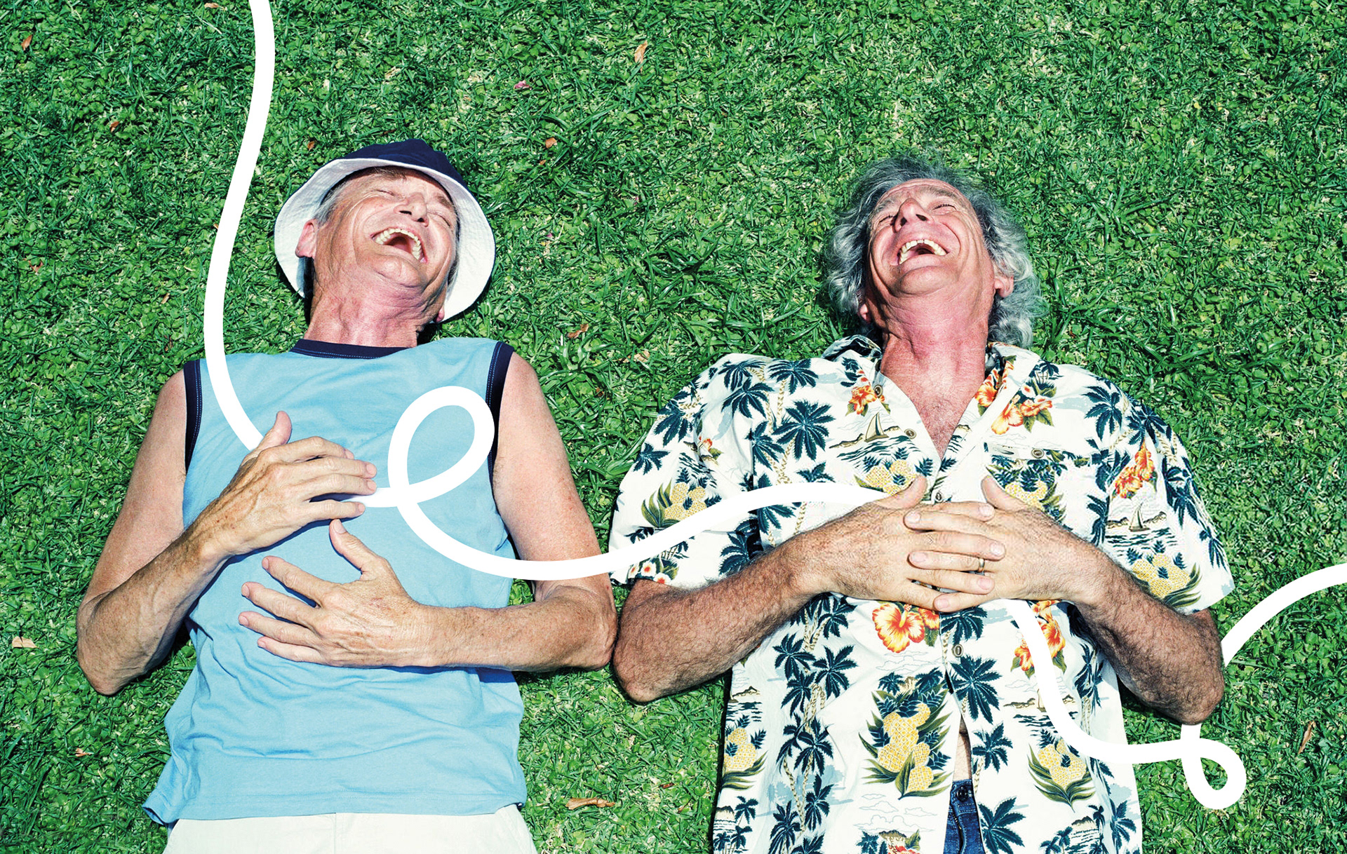
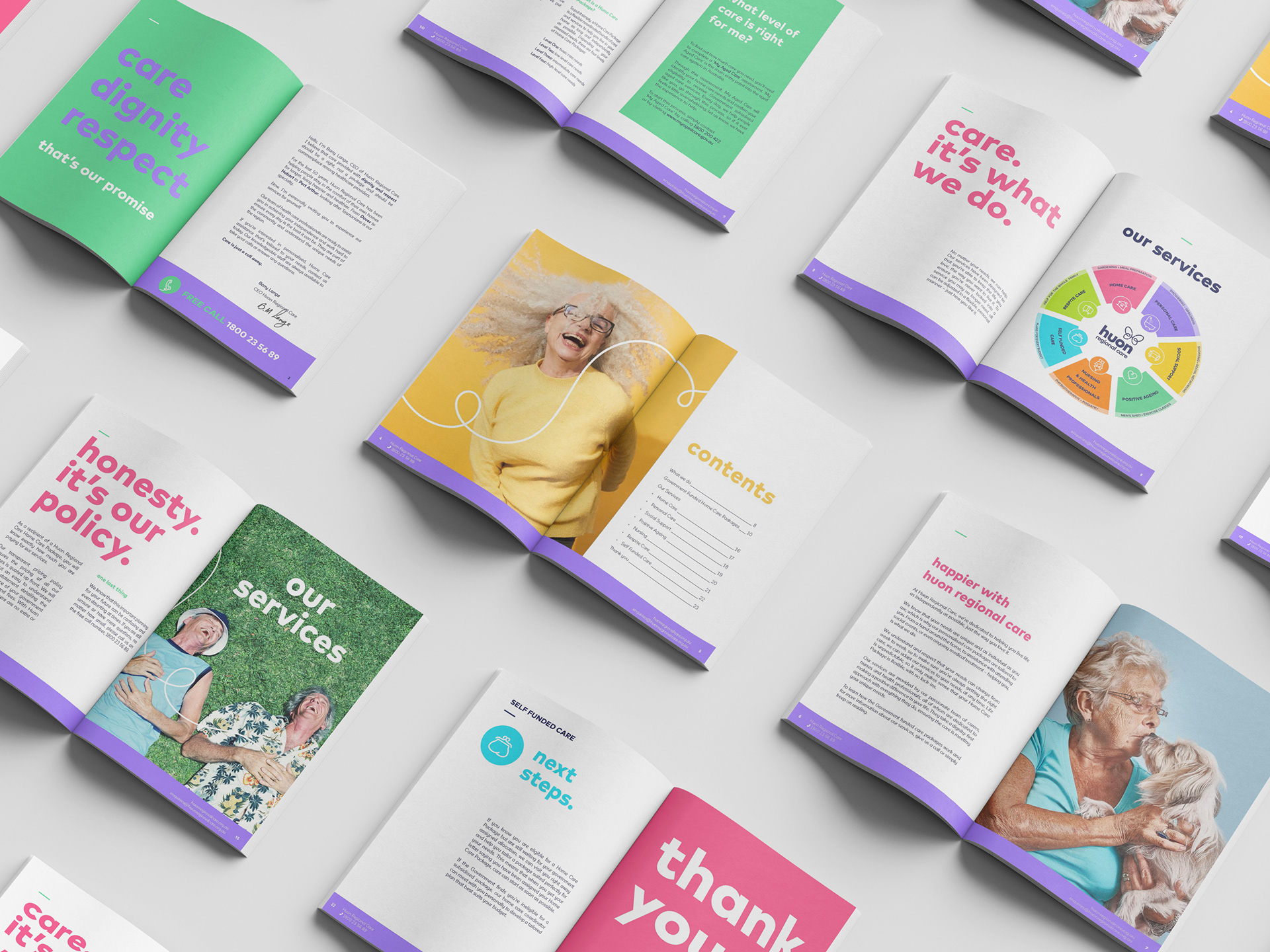
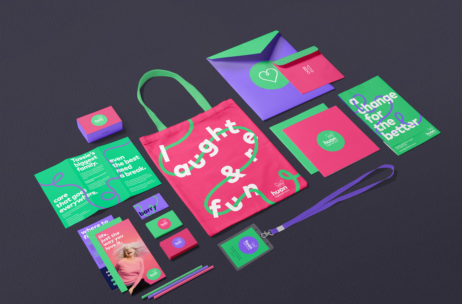
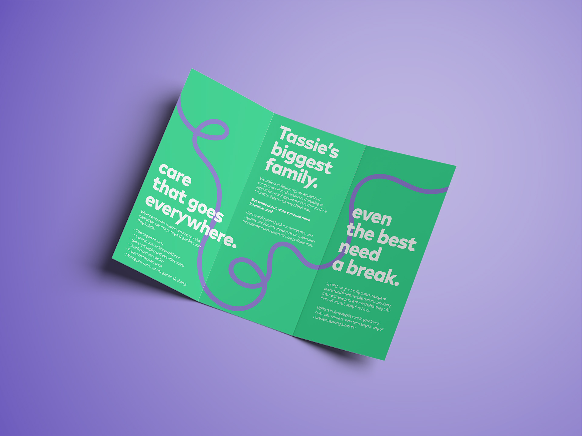
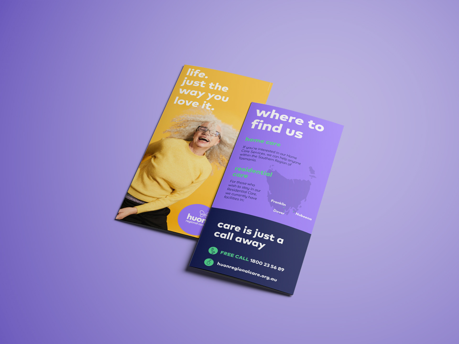
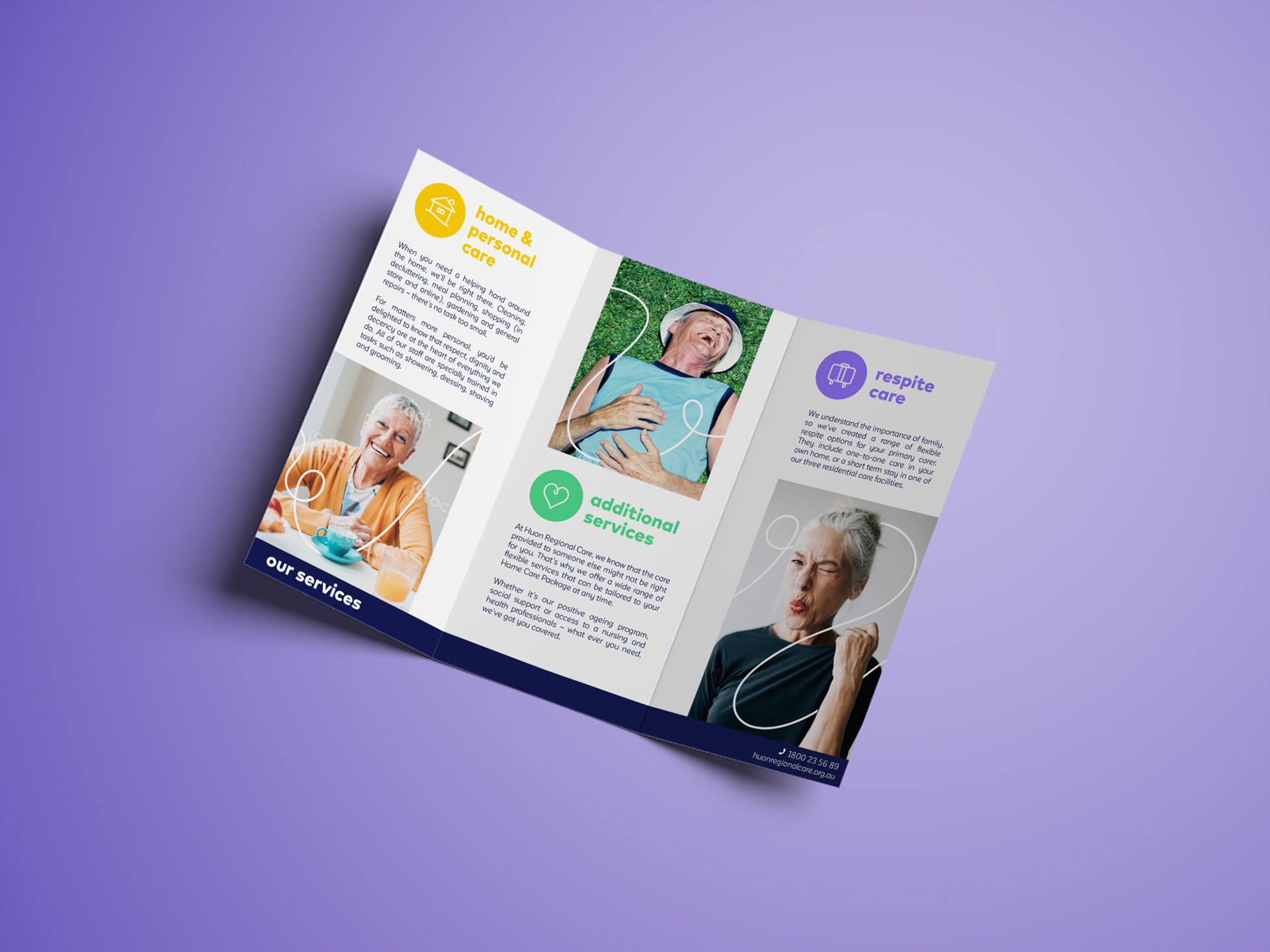
A Visual Language of Connection
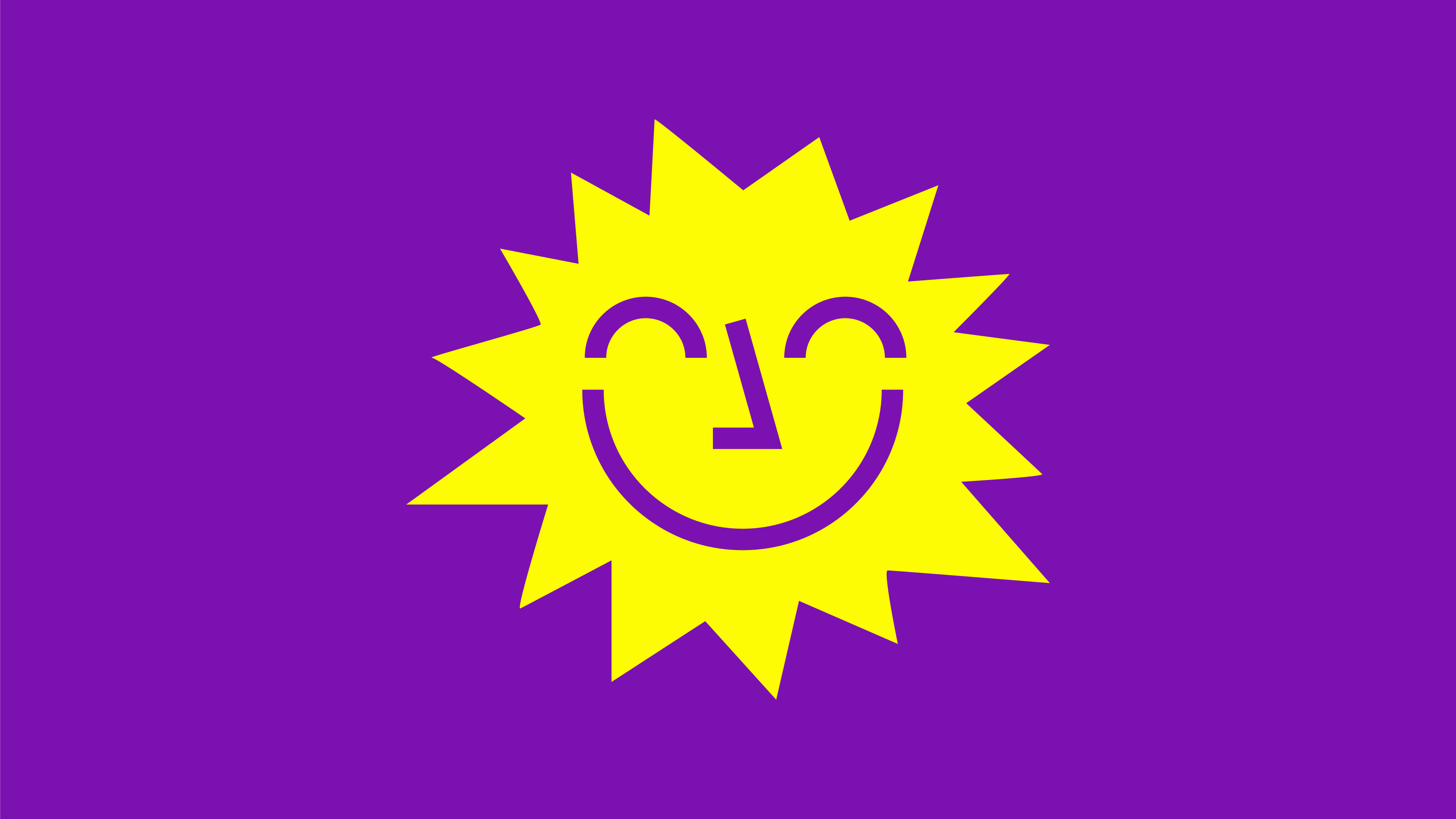
Starting with the existing logo, I crafted a new visual identity around a simple, powerful idea:
Change can be beautiful.
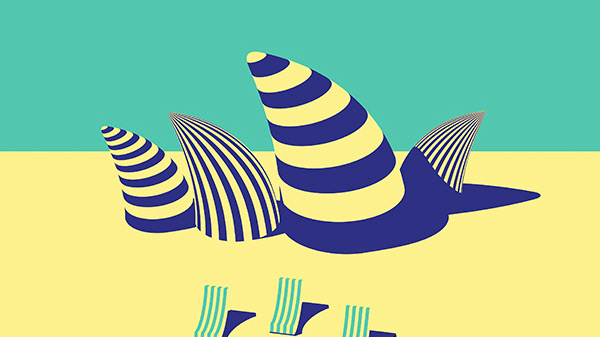
We introduced a soft, uplifting colour palette, far from the dull tones typical of the category.
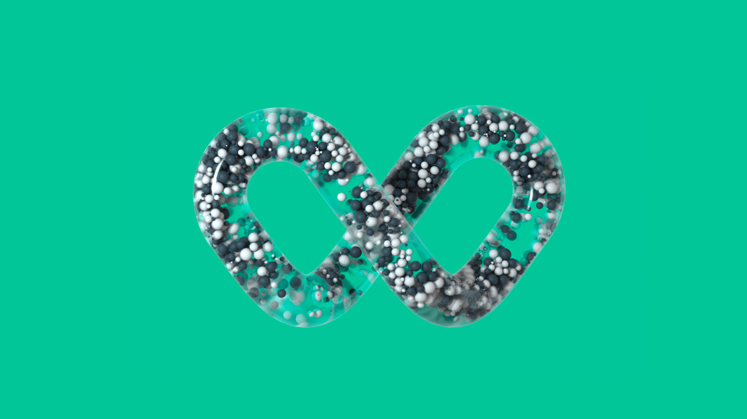
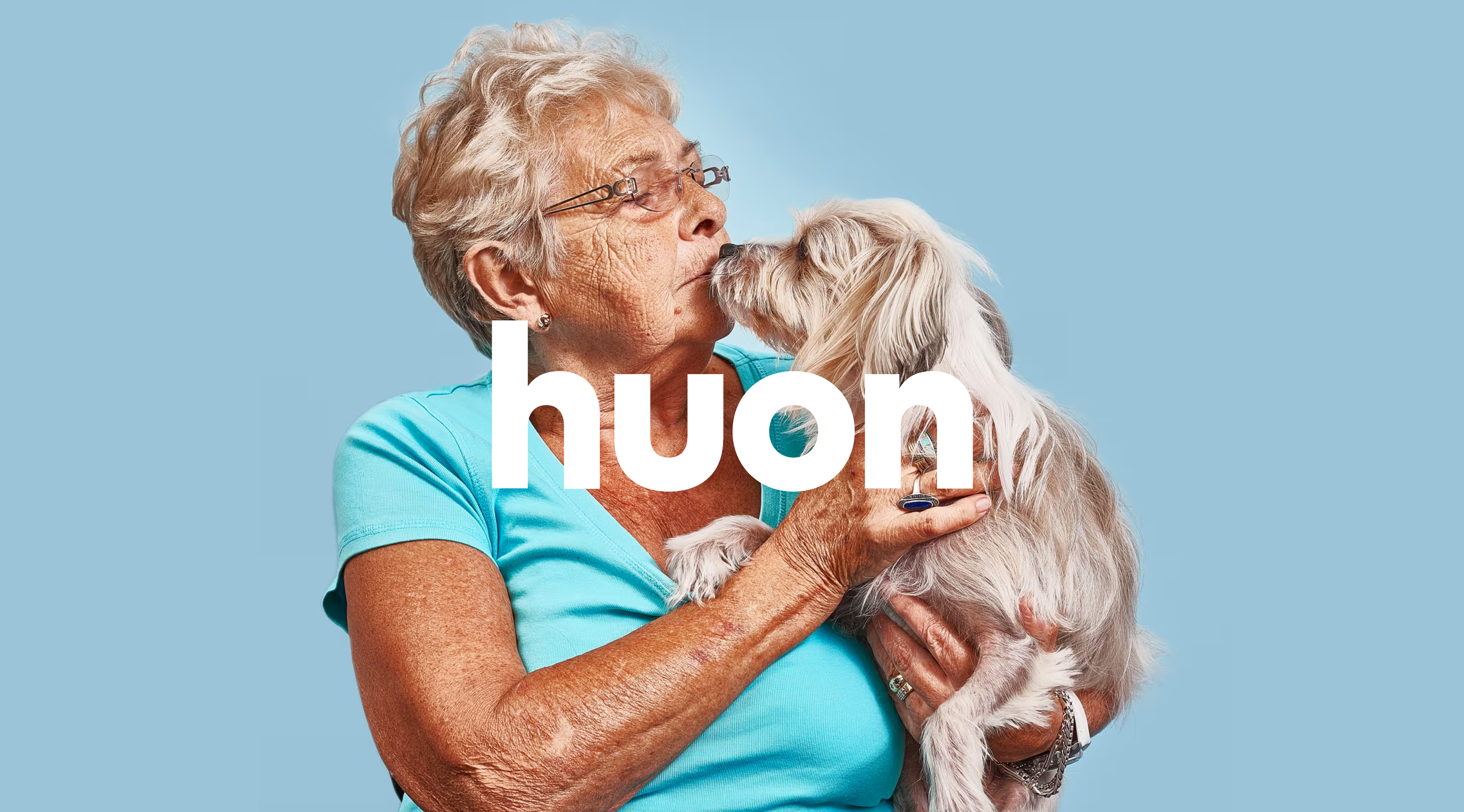
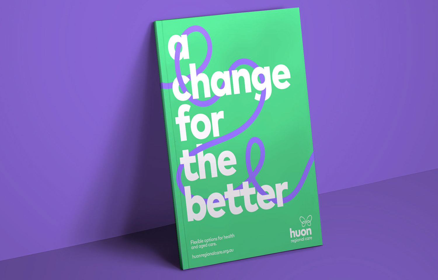
But the real game-changer? A continuous line graphic device symbolizing connection, the kind that exists between Huon’s carers and residents. Paired with thoughtful, locally shot photography and spacious layouts, the brand began to feel warm, personal, and quietly confident.
Change can be beautiful.
We introduced a soft, uplifting colour palette, far from the dull tones typical of the category.
But the real game-changer? A continuous line graphic device symbolizing connection, the kind that exists between Huon’s carers and residents. Paired with thoughtful, locally shot photography and spacious layouts, the brand began to feel warm, personal, and quietly confident.
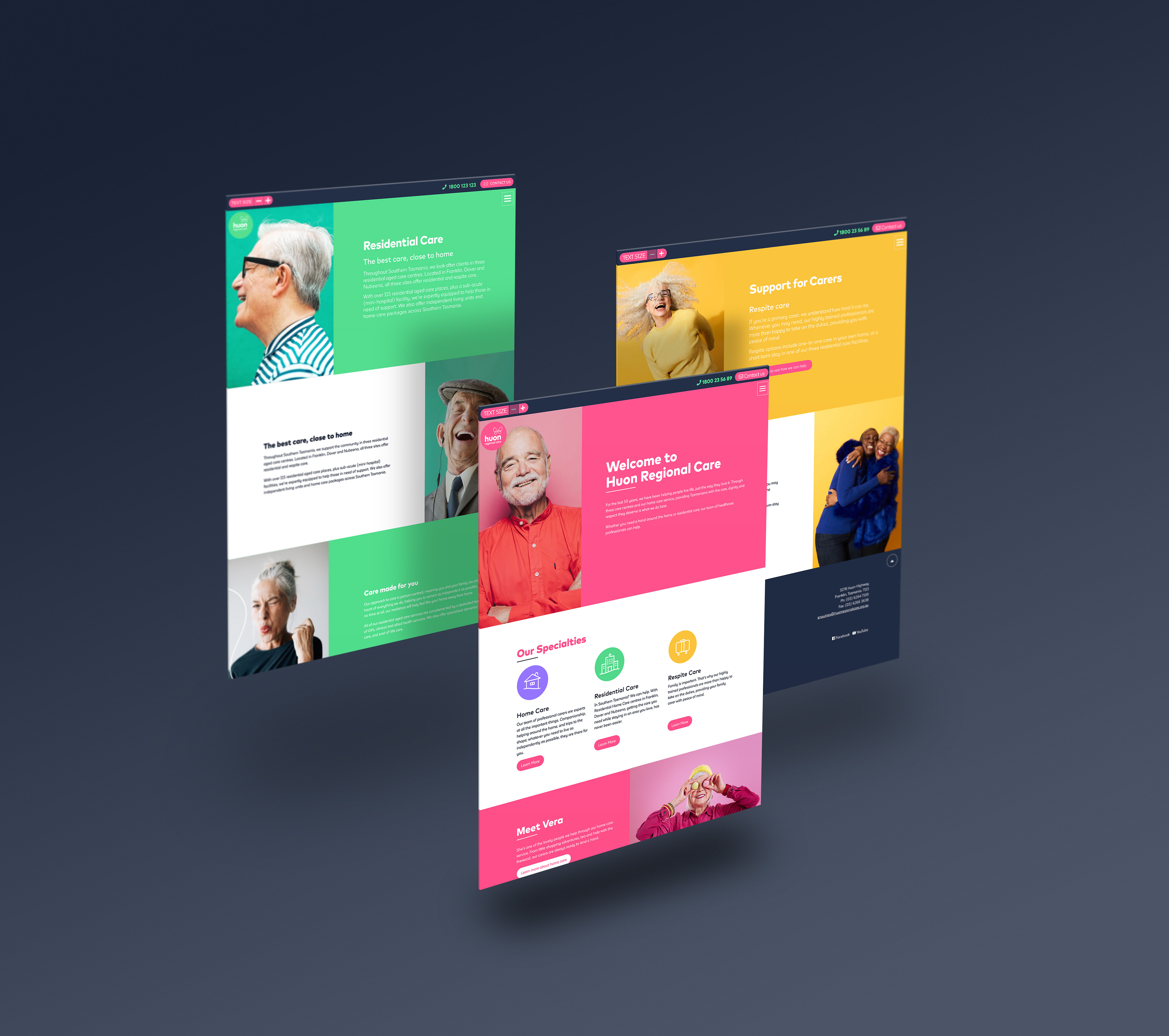
A whole new website
Alongside the brand refresh, we redesigned Huon’s website from the ground up:
• Streamlined navigation for families in decision-mode
• Clear service breakdowns, minus the jargon
• Scannable content with comforting tone and real-world imagery
• Accessible, mobile-friendly design that supports older users and carers alike
• Streamlined navigation for families in decision-mode
• Clear service breakdowns, minus the jargon
• Scannable content with comforting tone and real-world imagery
• Accessible, mobile-friendly design that supports older users and carers alike
What They Said
“This time can be one of uncertainty but also one for positive change, which the butterfly motif so beautifully captures.”
— Brian Merrifield, ECD, Common Ventures
— Brian Merrifield, ECD, Common Ventures
“We’re delighted with the result. A strong, clear brand reflecting our broad range of services for elderly Tasmanians.”
— Barry Lange, CEO, Huon Regional Care
— Barry Lange, CEO, Huon Regional Care
Why It Mattered
Huon gave me the chance to help reframe aged care as a moment of possibility, not loss.
It pushed me to think beyond screens and build a multi-touchpoint brand that speaks with clarity and kindness.
It pushed me to think beyond screens and build a multi-touchpoint brand that speaks with clarity and kindness.