The Challenge:
In its 3rd year, Parrtjima, a light festival in Alice Springs, needed to move away from local negative perceptions and start to elevate awareness of the 2-week long event on a national level.
The festival, still in its infancy, needed to not over-promise but find differentiation through brand repositioning to focus on a more targeted audience and adjust the on-ground experience.
Role: Art Direction | Design | UX/UI
Agency: COMMON V
Our Insight:
We identified a gap in the national market for a festival that was premium, but transcendent rather than interest-led.
Due to this, we identified Parrtjima as: ‘a festival that makes people feel the sublime by creating collective cultural experiences that allow you to interact with the people, yarns and landscape on an unexpected & intimate level.’
We positioned the festival as an event that would encourage people to see indigenous culture in a new light.
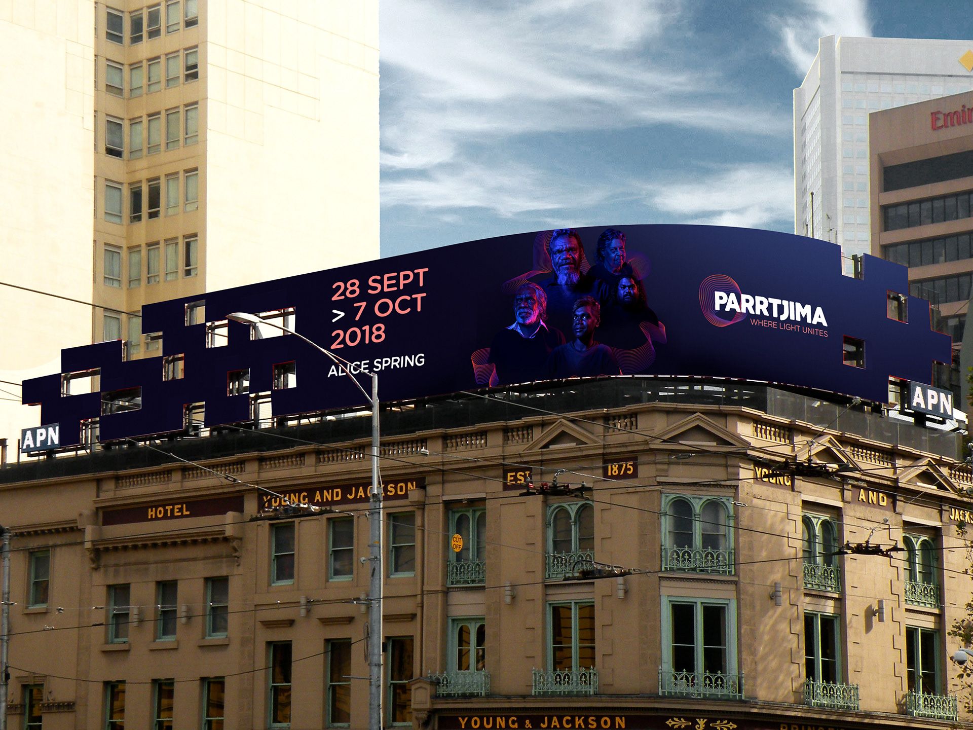
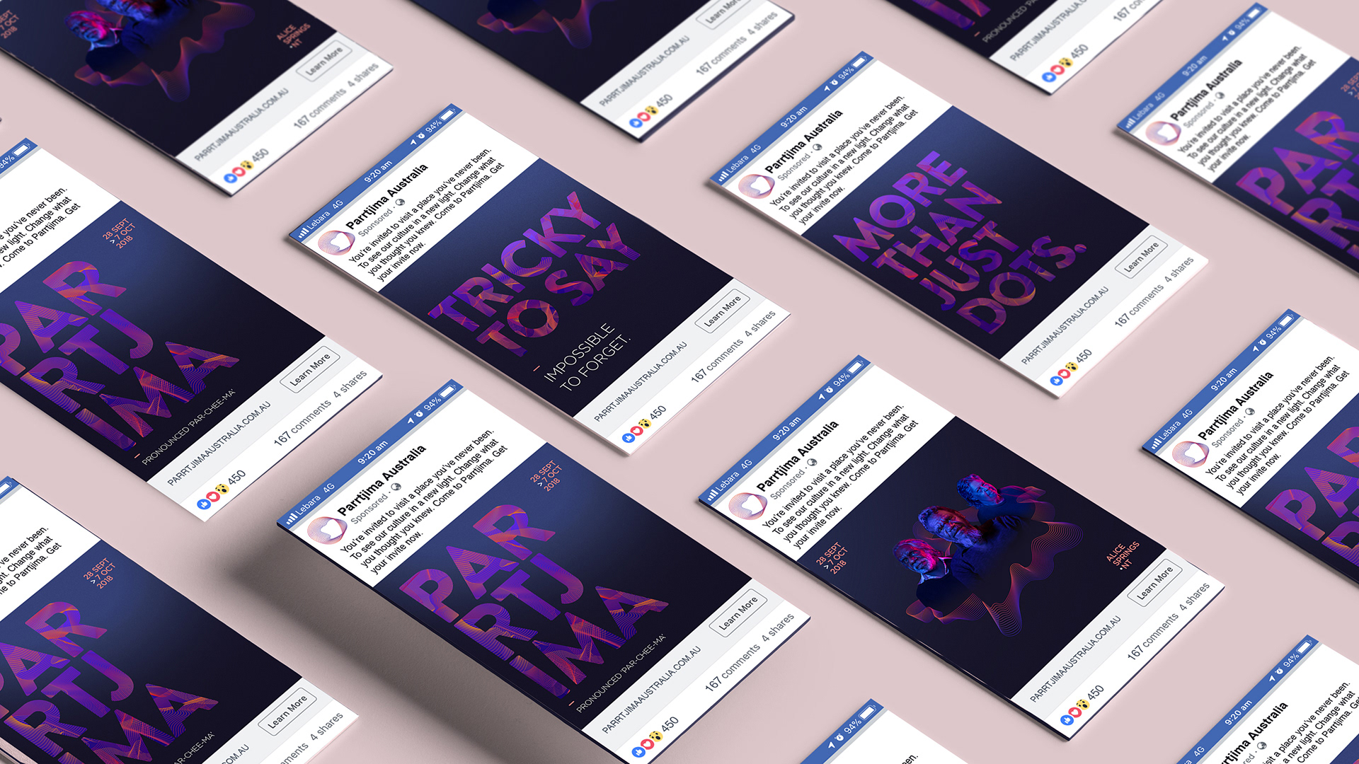
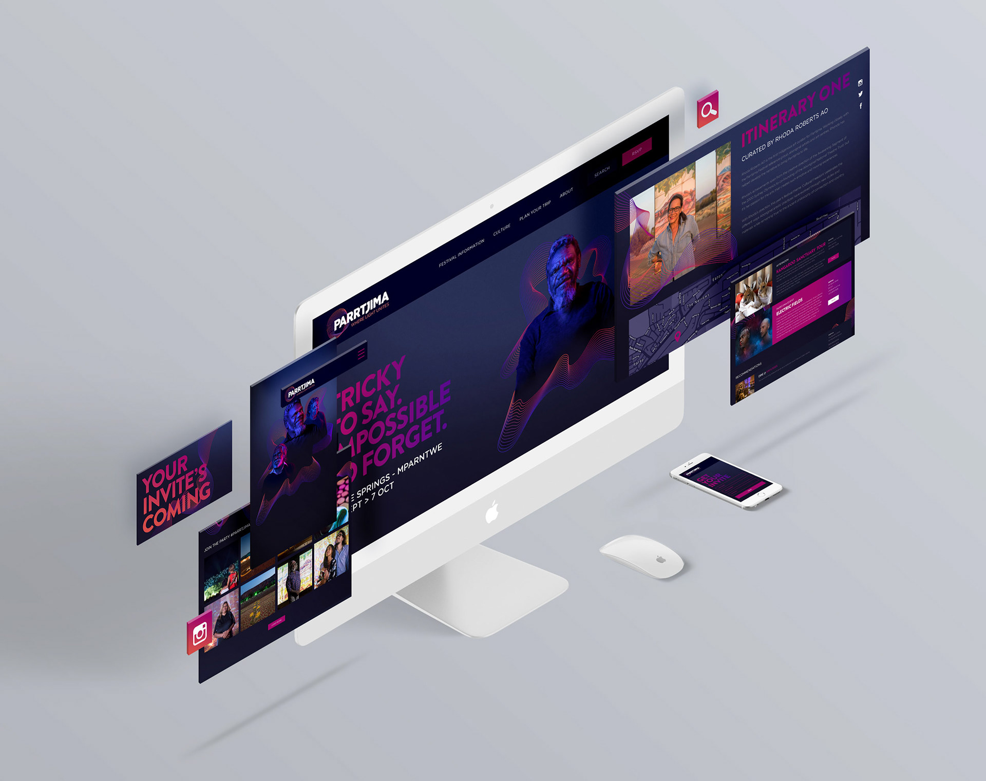
PARRTJIMA: ‘A FESTIVAL WHERE LIGHT UNITES’
This was the guiding thought for all branding elements, messaging and program initiatives. With a focus on co-creation, the festival explored the creation of rituals between Aboriginal and non-aboriginal Australians at Parrtjima.
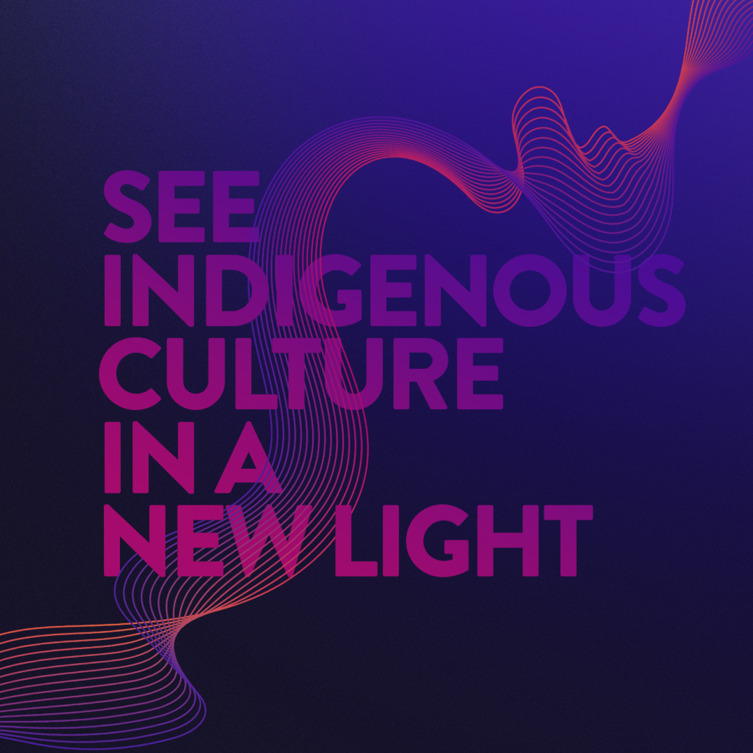
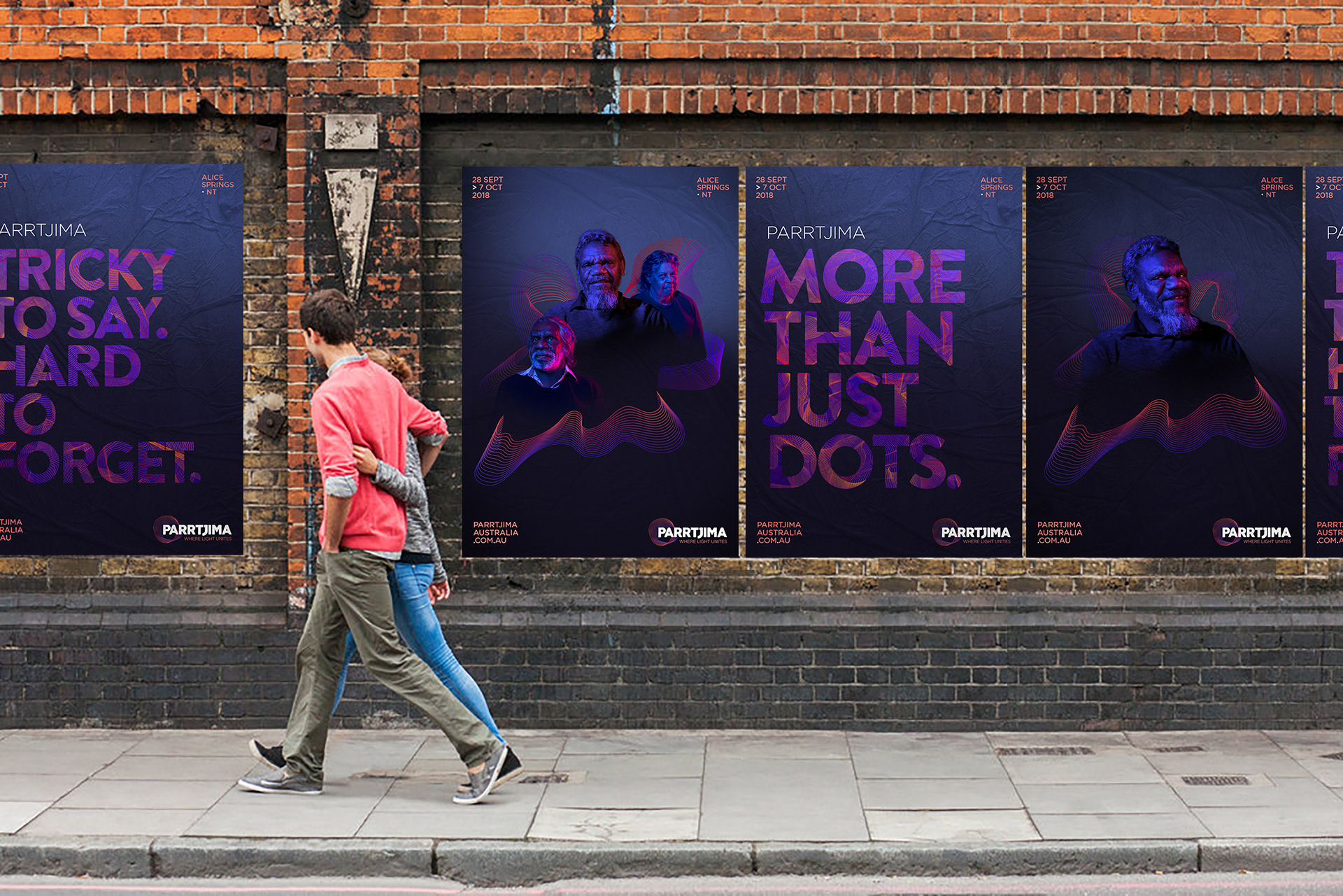
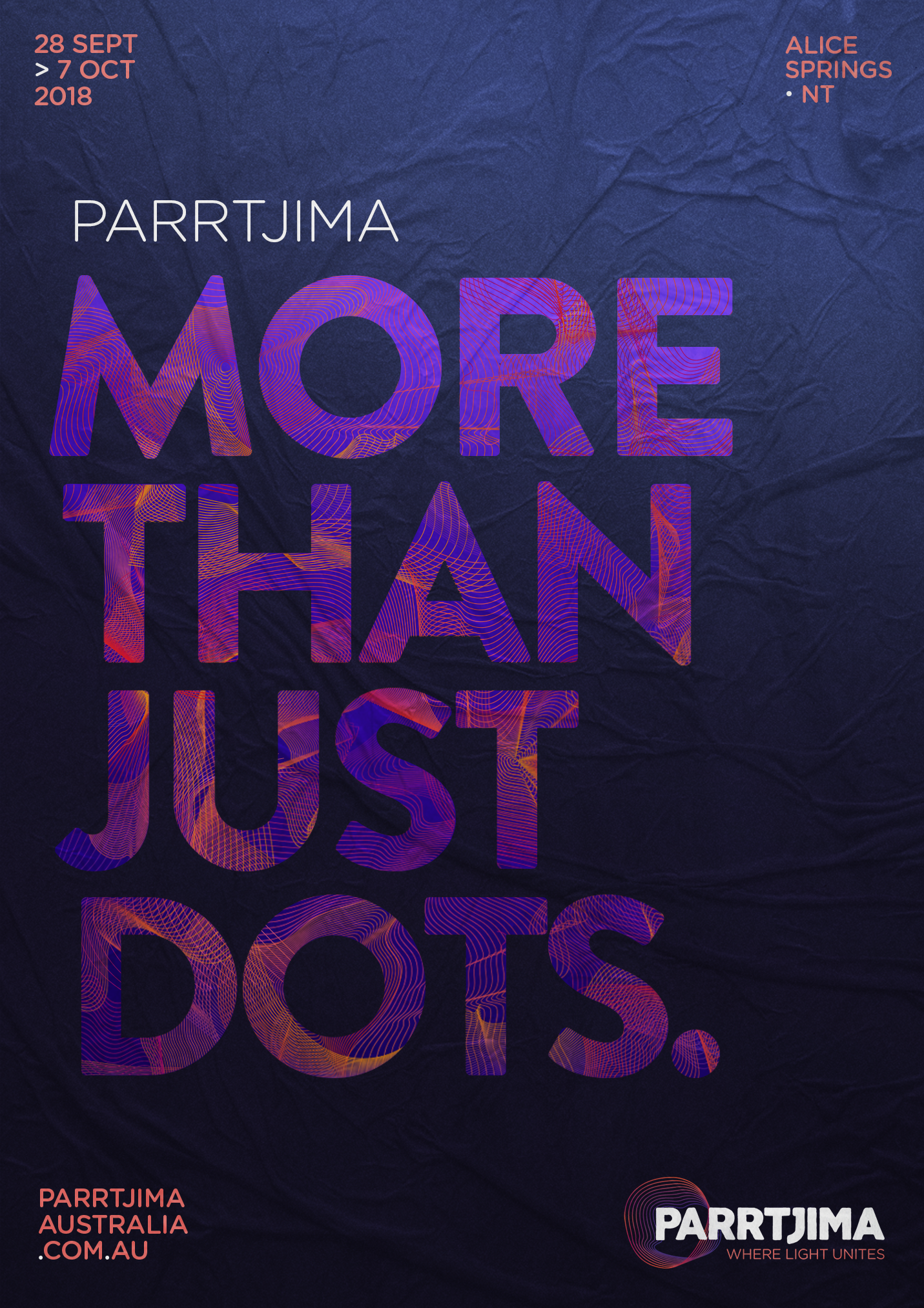
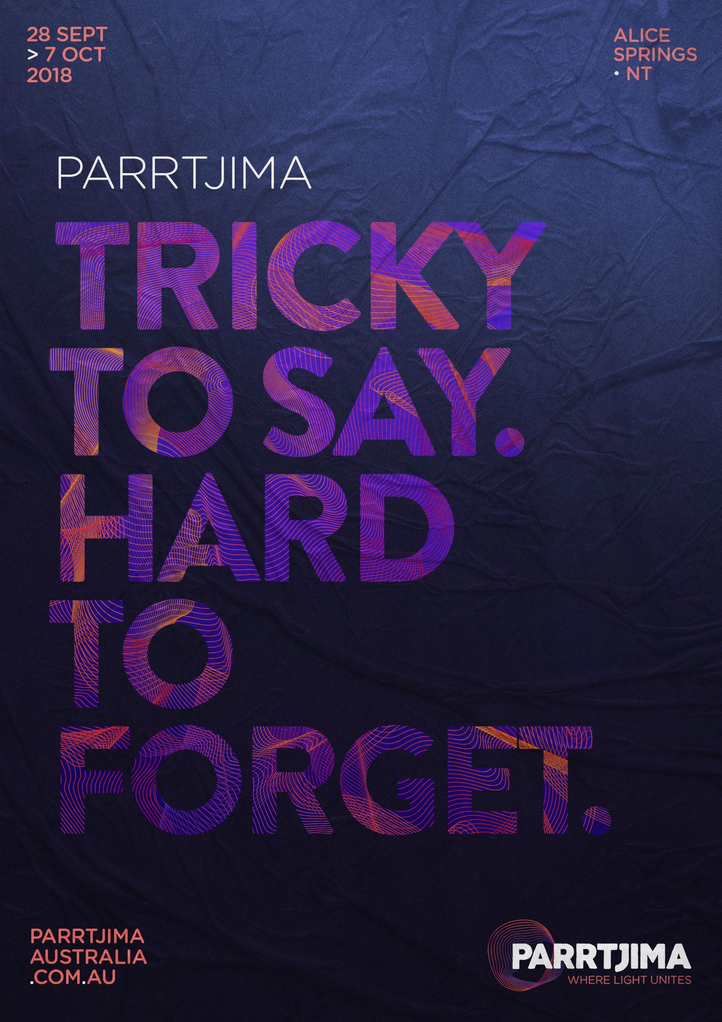
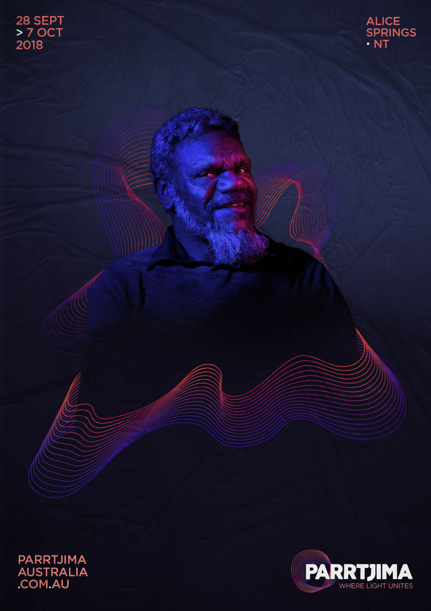
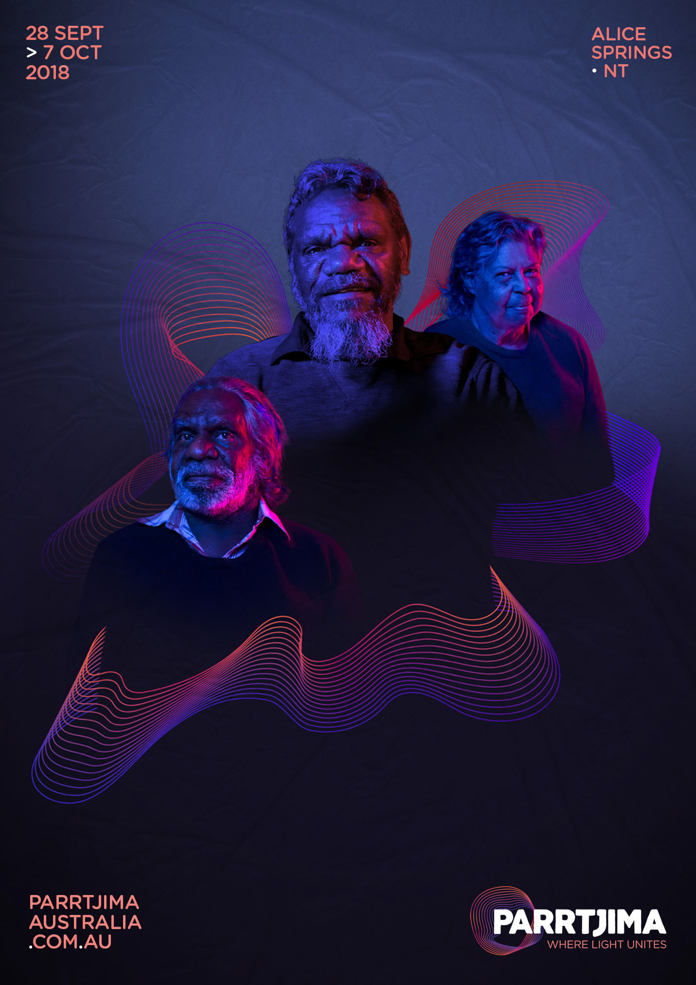
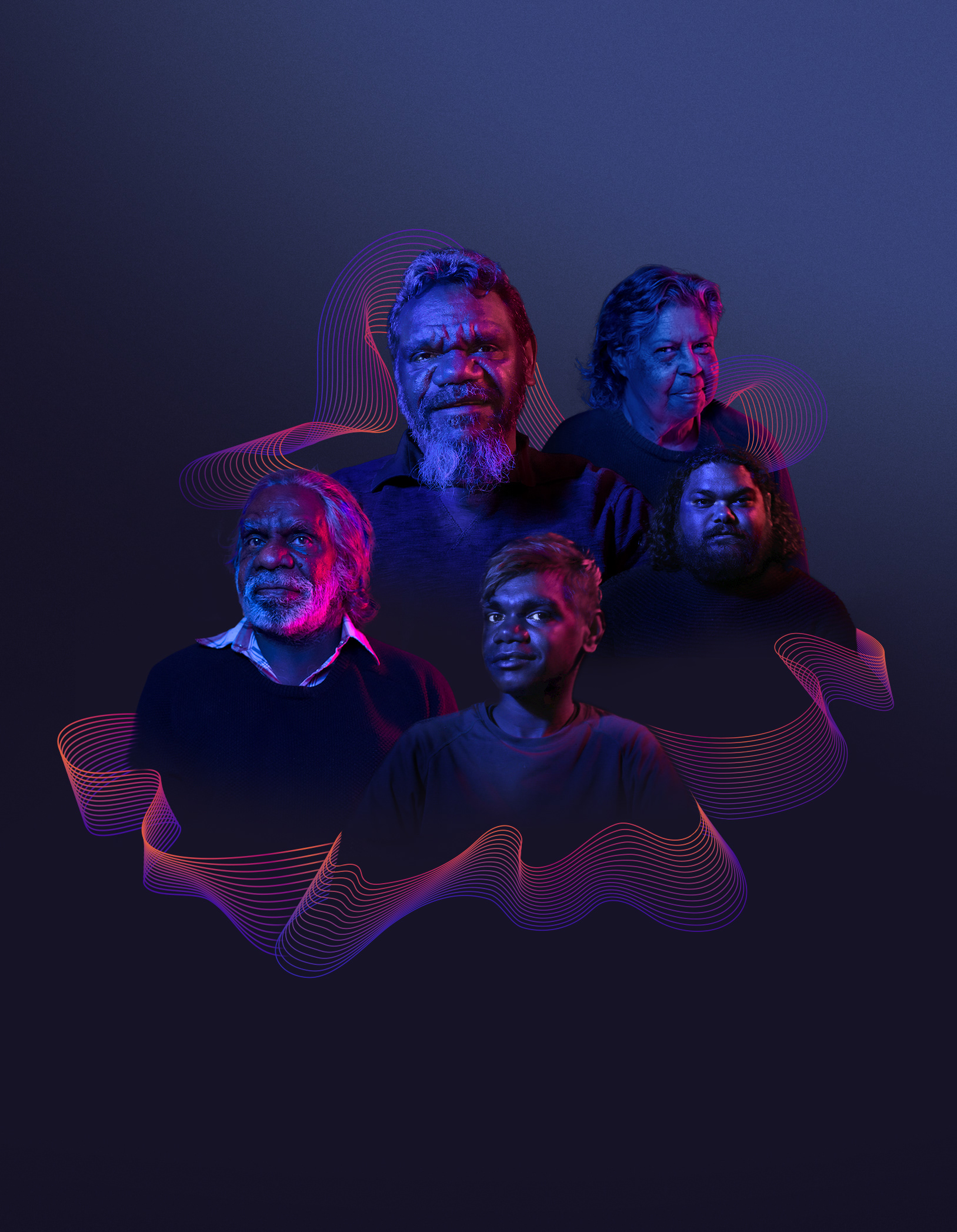
With the typography and the photography I wanted to explore a representation of how the Parrtjima festival could truly remix this ancient culture with new technology